Tailwind CSS Application UI Blocks
Tailwind CSS application UI blocks for SaaS and admin dashboards, charts, sidebars, forms, tables, billing, navigation, authentication, modals, and drawers.
Analytics & KPIs
Charts, KPI cards, ranking cards, progress cards, and data maps for dashboards, reporting views, executive summaries, and analytics-heavy product interfaces.
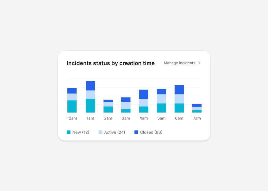
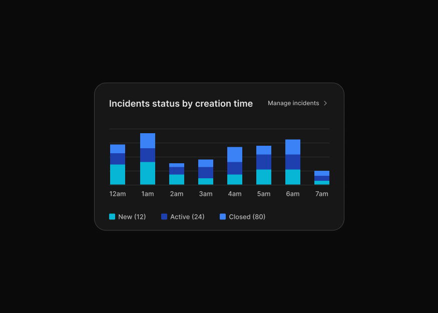
Bar Charts New
9 components


Line & Area Charts
5 components


Pie & Radial Charts New
6 components
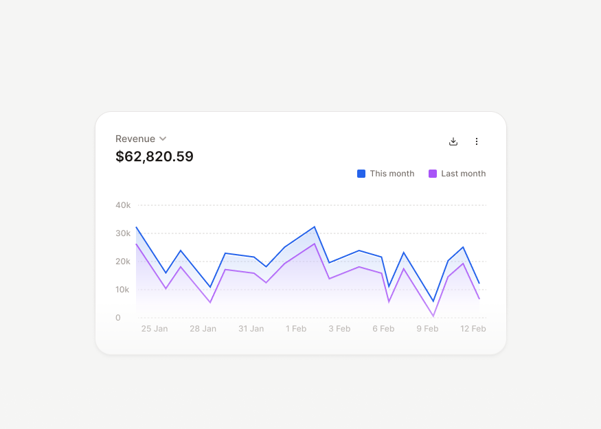
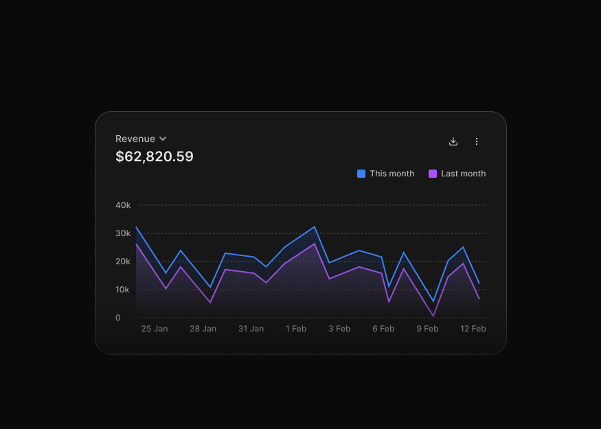
Chart Compositions New
10 components
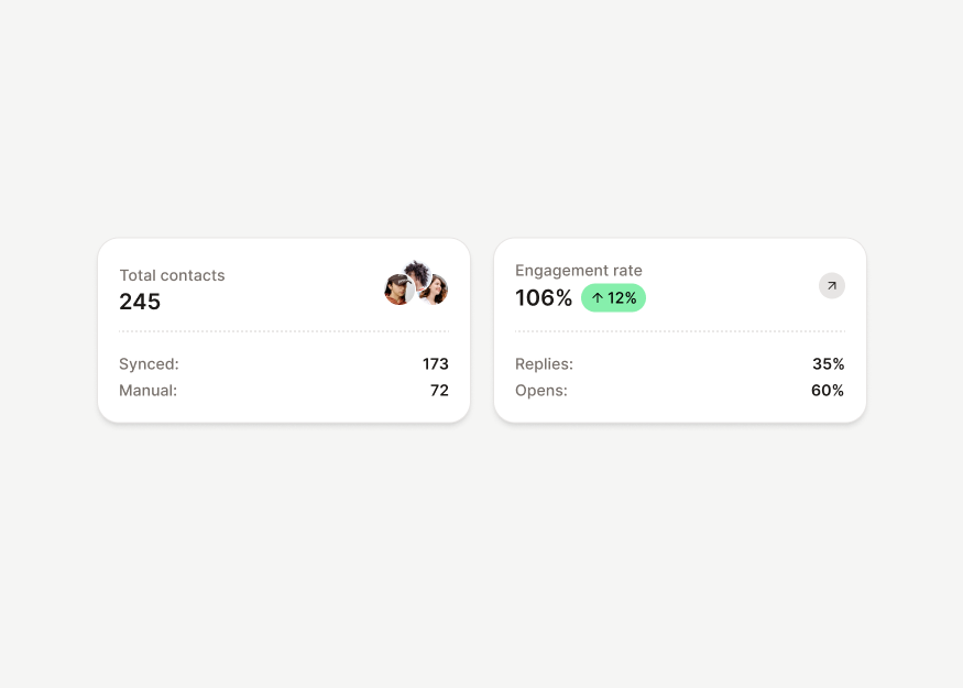
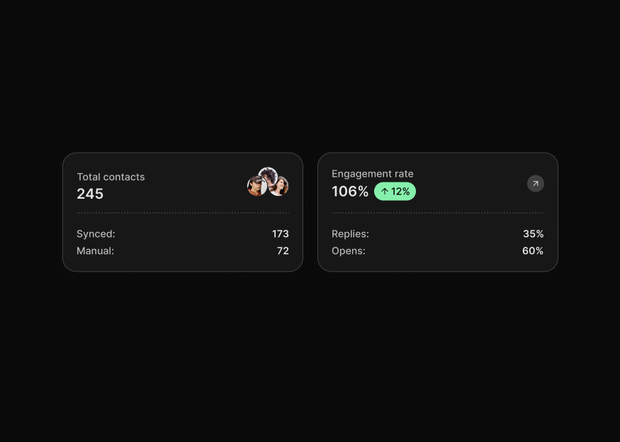
KPI Cards
17 components
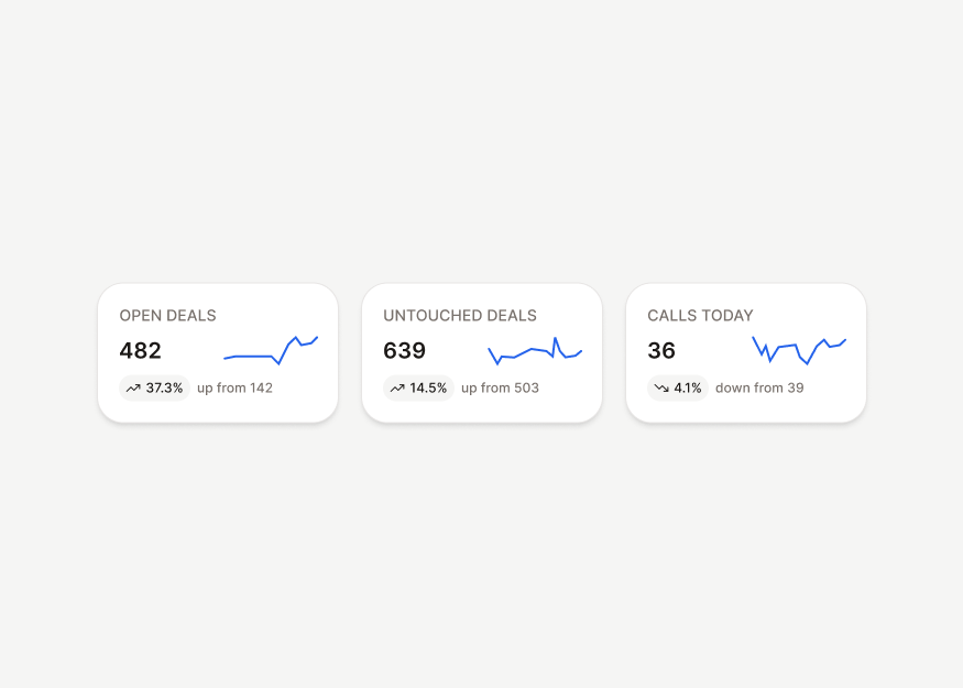
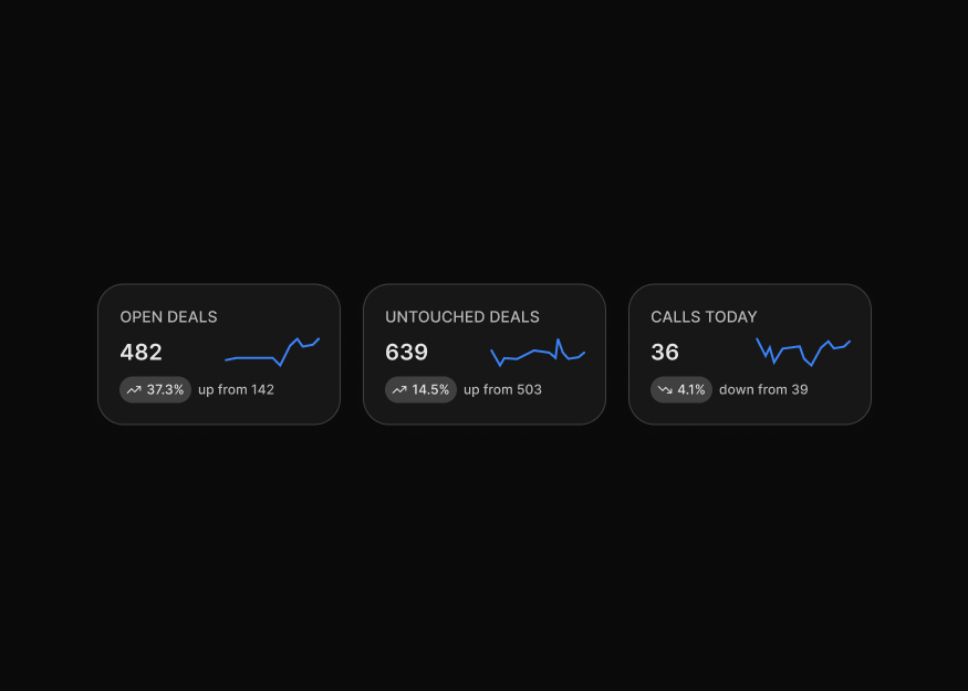
Spark Charts New
5 components
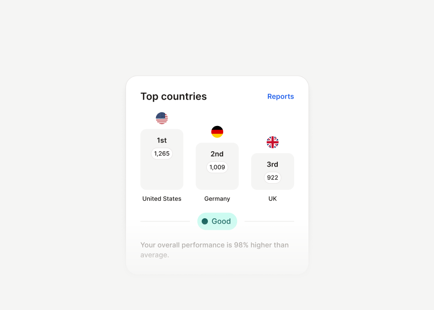
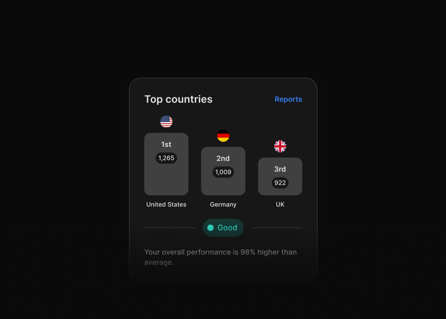
Ranking Cards
3 components


Progress Cards New
15 components
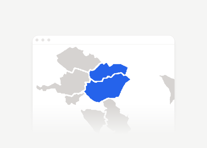
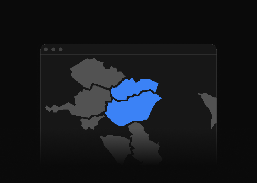
Data Maps
1 components
Data Display
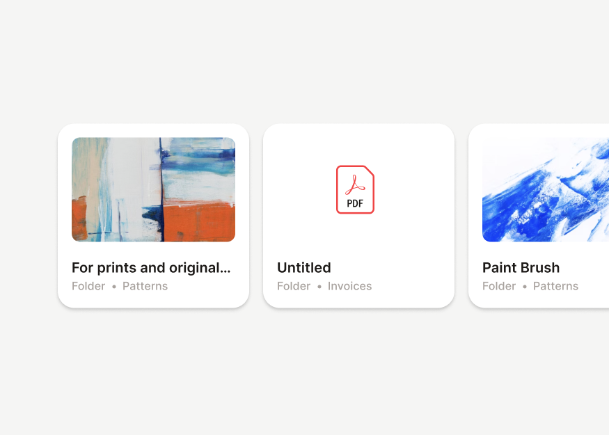
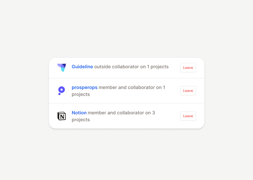
List groups, timelines, file views, projects, activity feeds, integrations, and structured workspace surfaces for scanning, monitoring, and operational display.




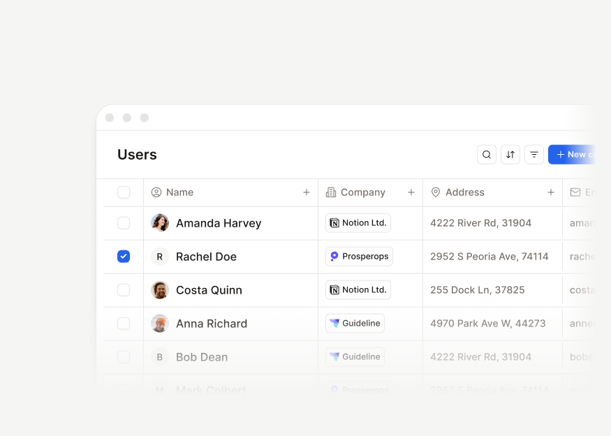
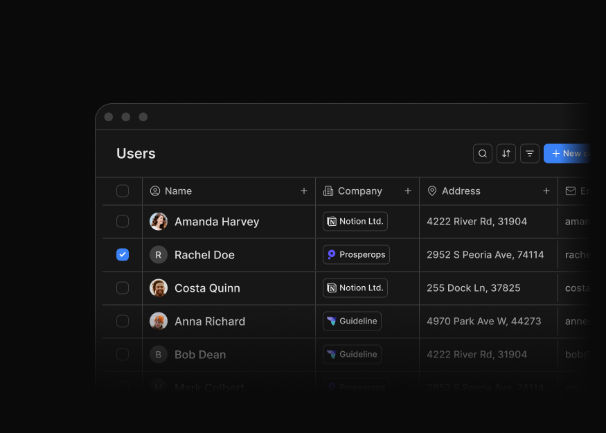
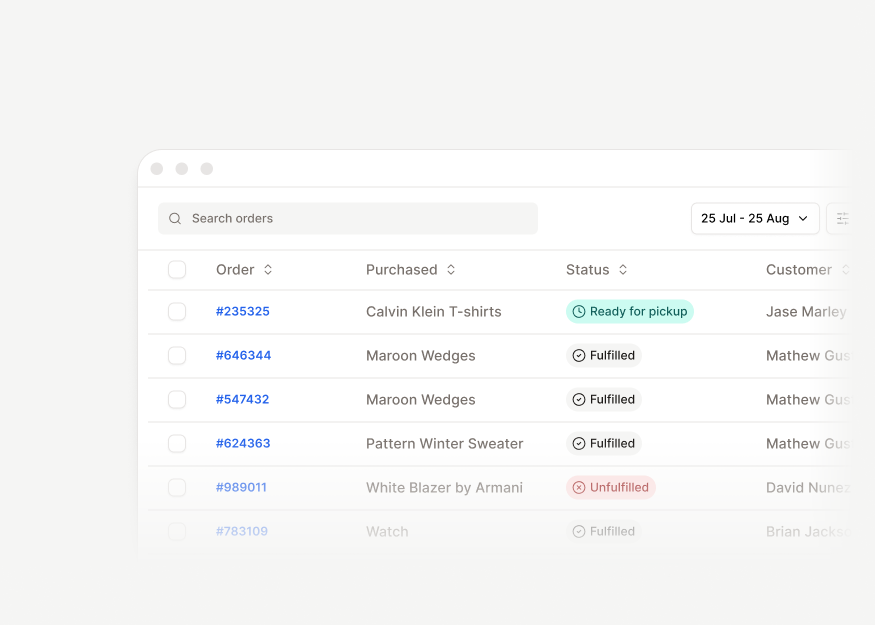
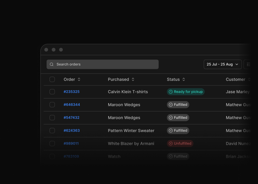
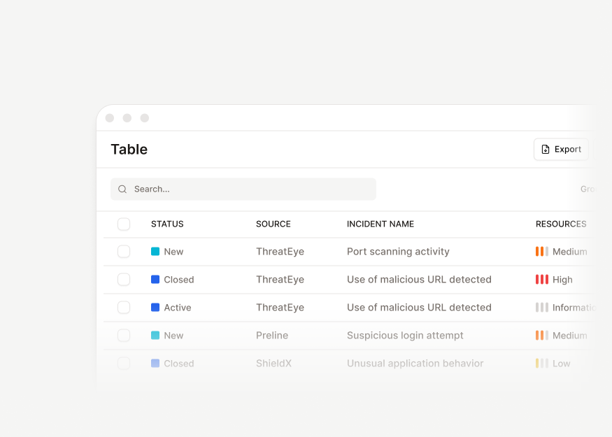
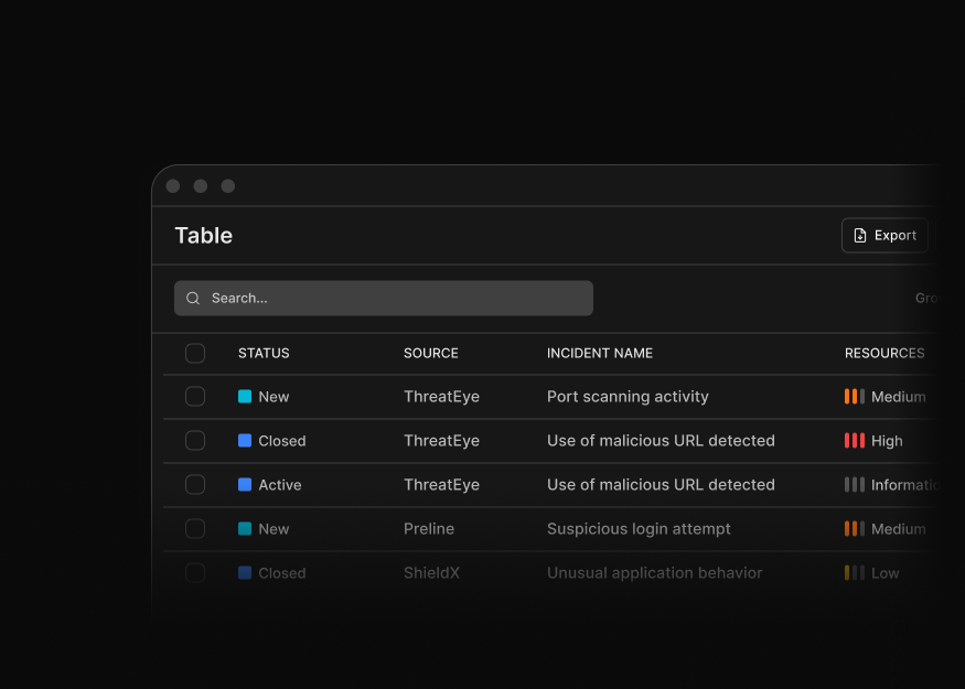
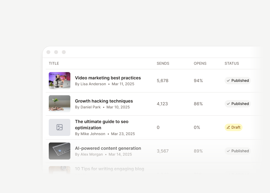
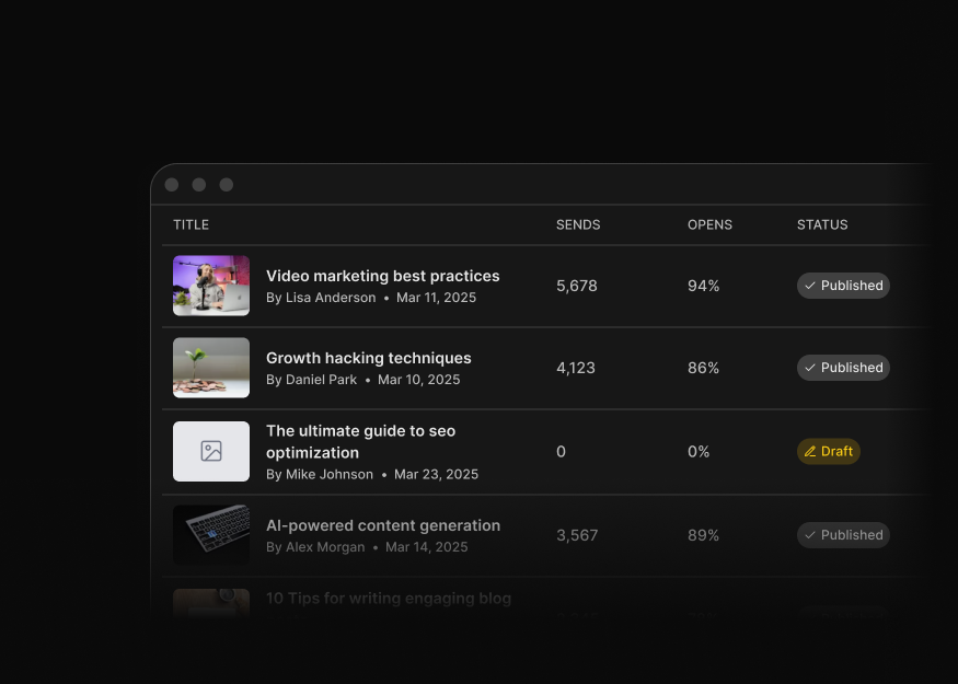
Tables
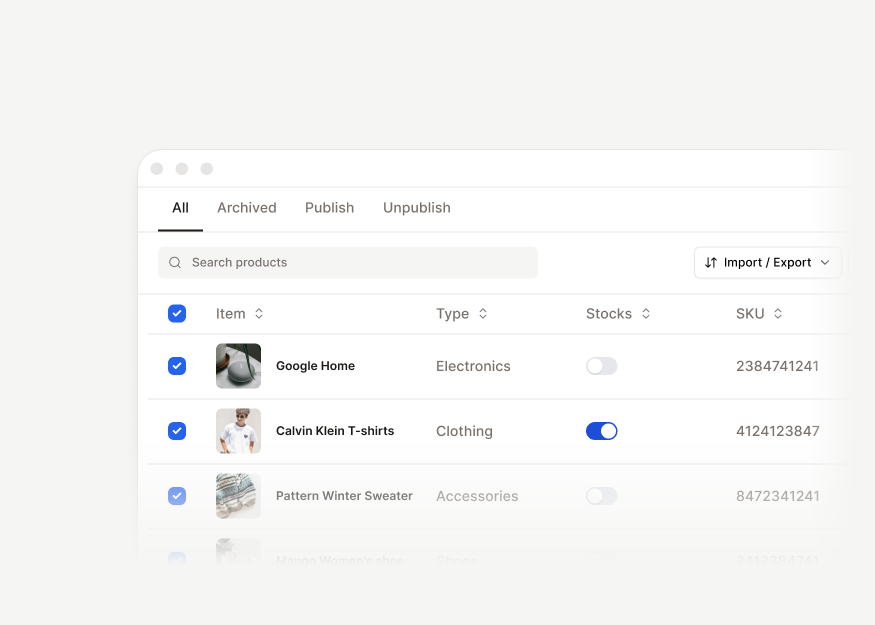
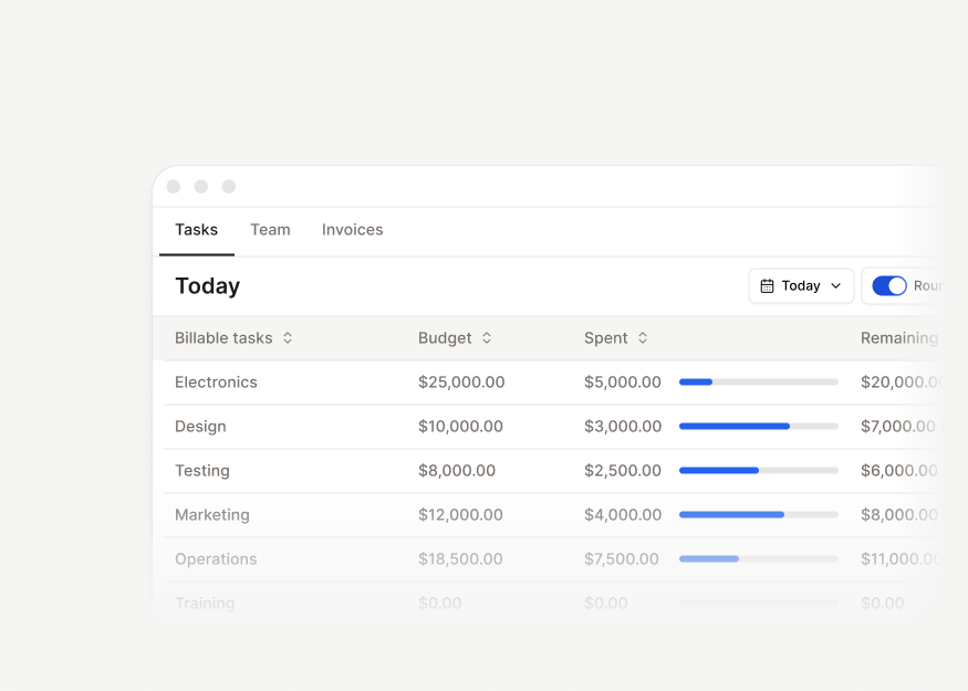
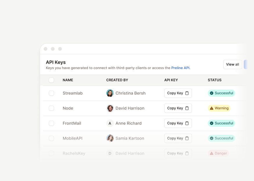
Record tables, order tables, product tables, project tables, and other structured admin data grids for application interfaces.
Forms
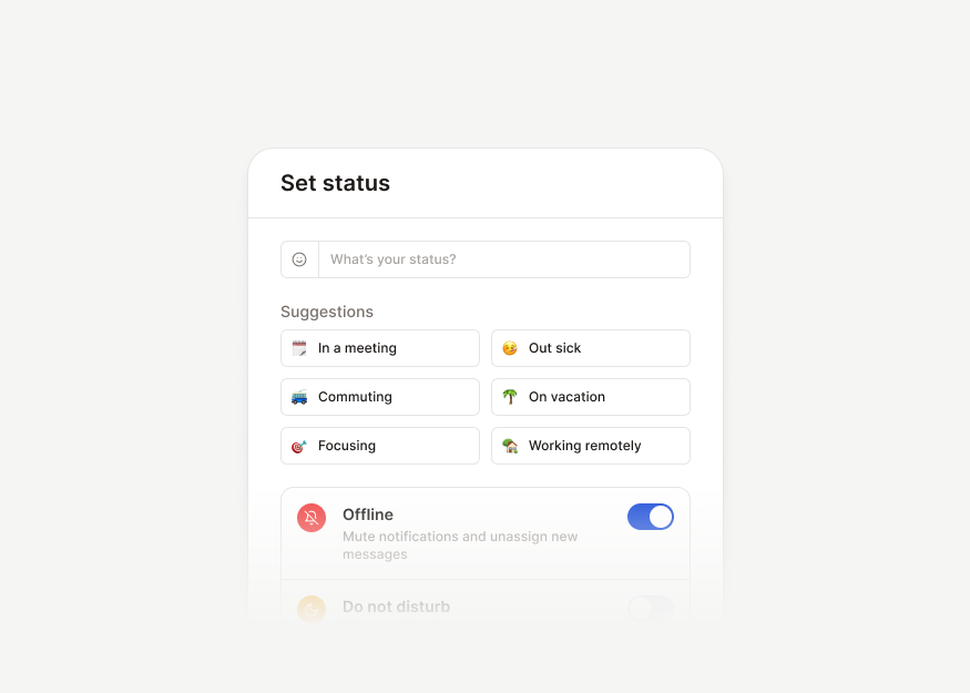
Billing, uploads, filters, form layouts, create flows, and data-entry patterns for product workflows and back offices.
Advanced Forms
5 components


Transfer Forms
3 components


Form Pages & Settings New
11 components


Text Editors
3 components


Message Composer Textareas
9 components


Utility Textareas
1 components


Option Pickers New
13 components


Selectable Cards & Lists
14 components


Checkbox & Preference Controls
8 components


Ratings & Emoji Selectors
6 components


Switches
5 components


Create & Edit Forms
10 components
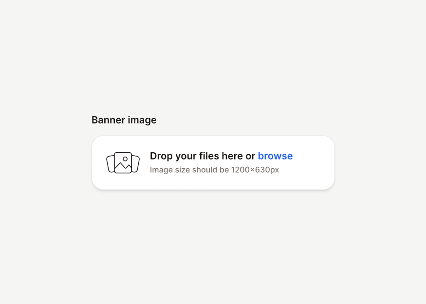
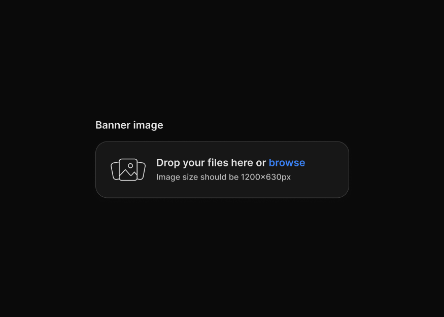
File Upload Forms New
4 components


Image Upload Forms New
3 components


Document & Import Uploads
2 components
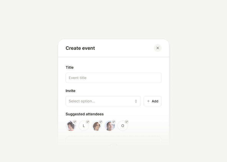
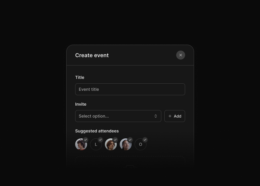
Create & Edit Form Modals New
10 components
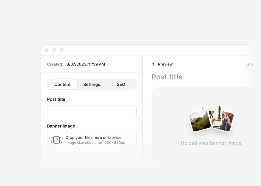
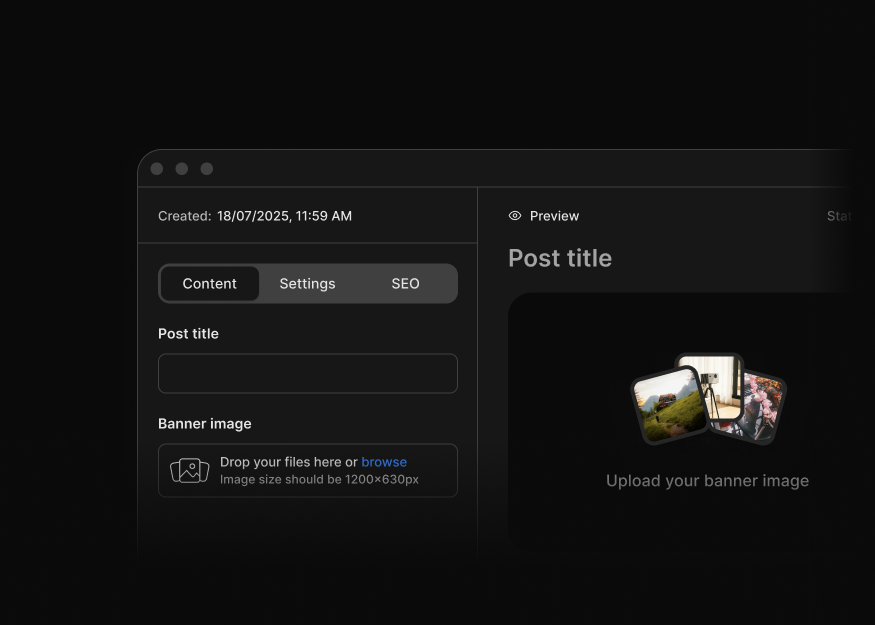
Content Editor Forms
1 components


Range Controls
3 components


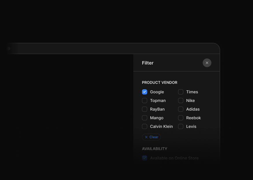
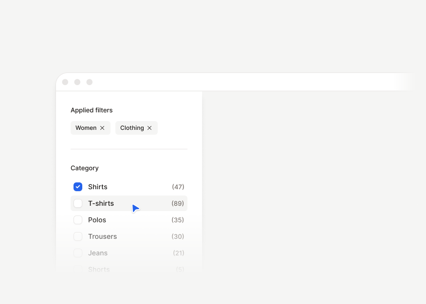
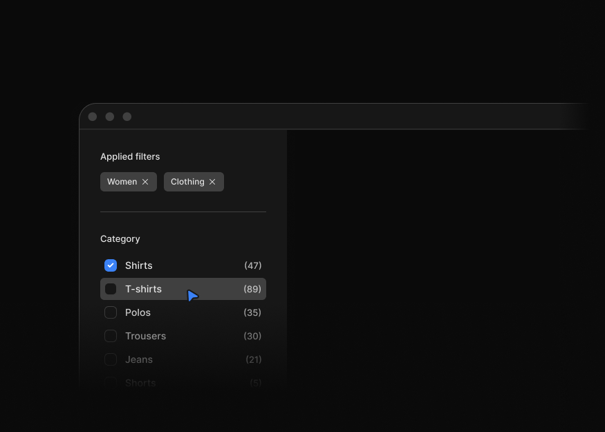
Filter Panels
3 components
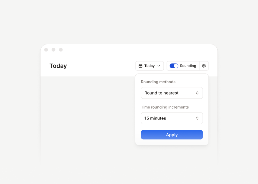
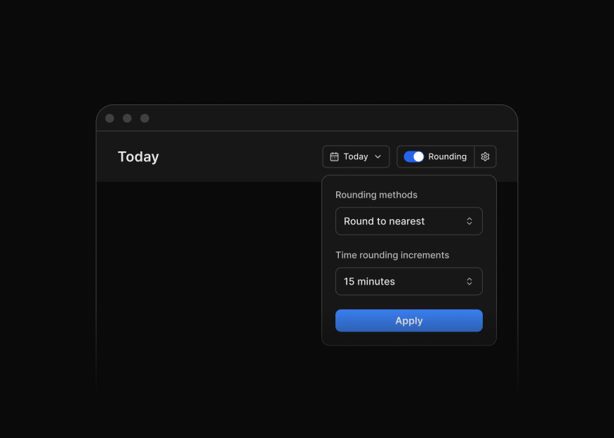
Filter Bars
12 components


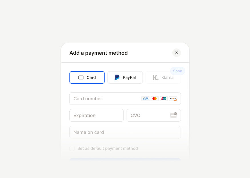
Payment Method Forms
6 components
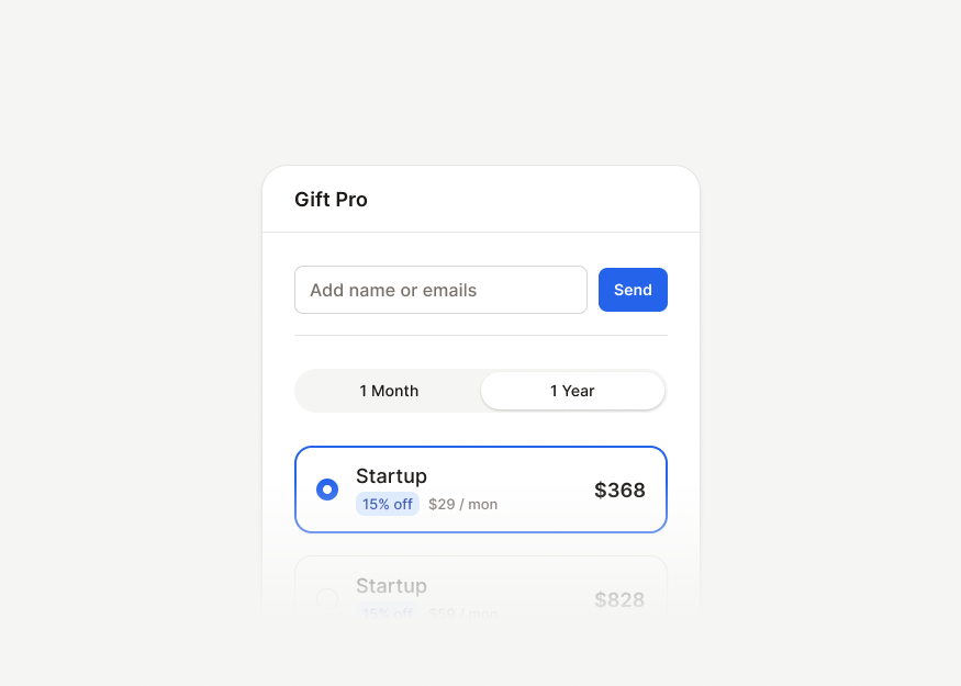
Billing & Upgrade Forms
3 components
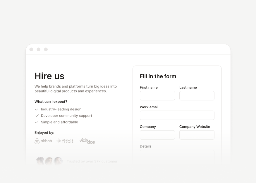
Contact & Feedback Forms
3 components


Newsletter Signup Forms
4 components


Product Review Forms
1 components
Authentication
Login, signup, reset password, verification, and onboarding flows for account access and setup journeys.


Application Pages
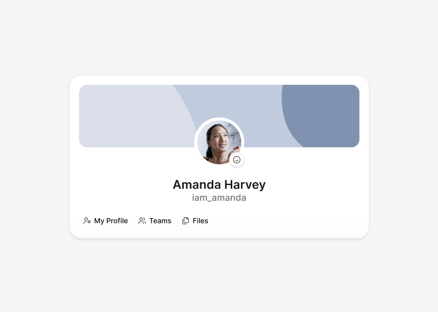
Admin screens, user profiles, AI interfaces, and account-focused application pages for operators, members, and product workspaces.


Billing & Payments
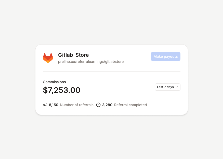
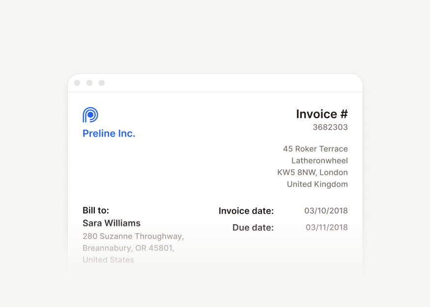
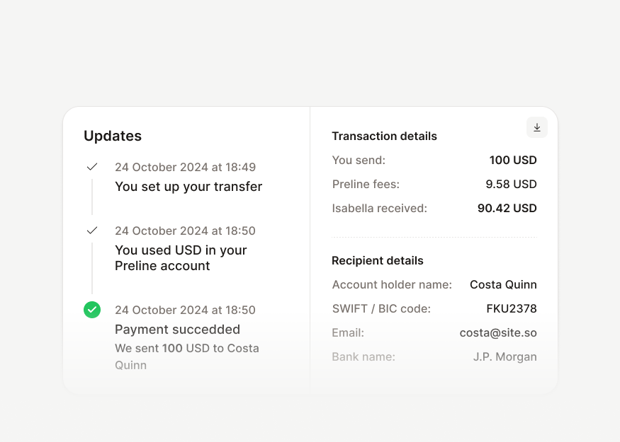
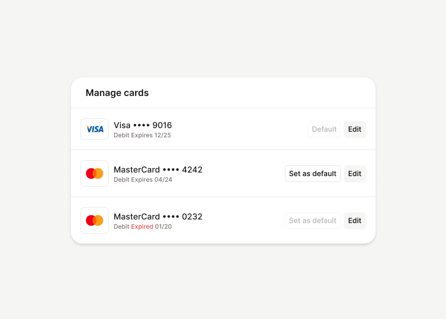
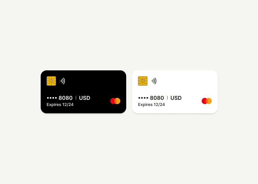
Payment cards, subscription plans, invoices, transaction details, billing dialogs, and payment methods for billing and finance workflows.


Communication
Chat, inbox, voice, video, and contact blocks for messaging, support, and collaboration products.
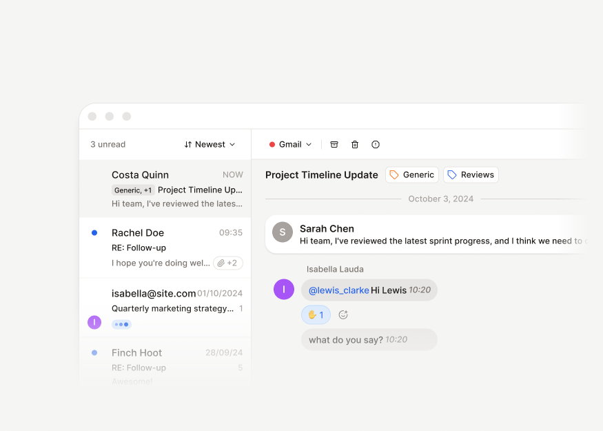
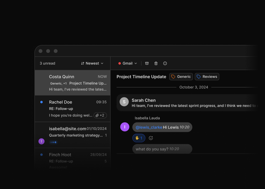
Inbox Layouts
1 components
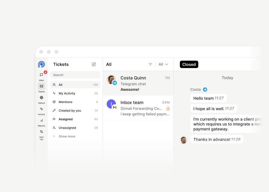
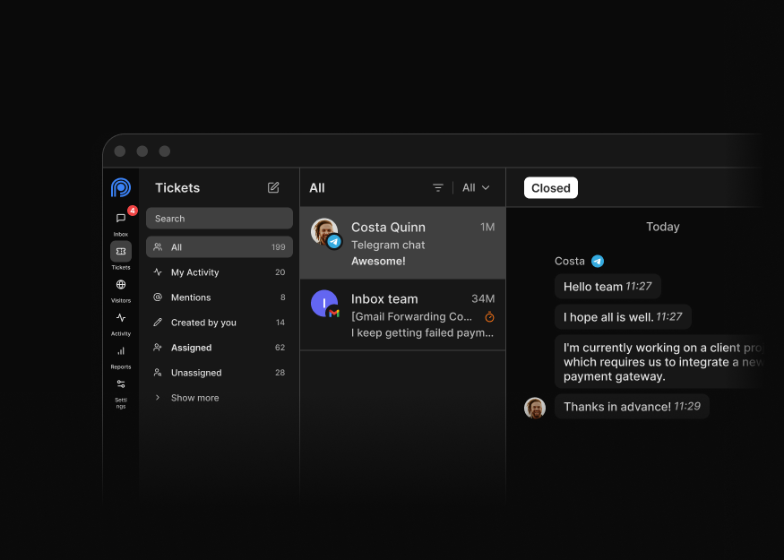
Chat Workspace Layouts
6 components
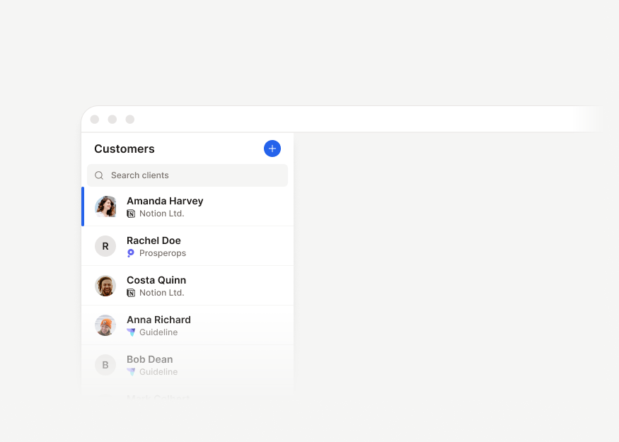
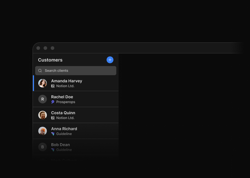
Customer Detail Layouts
1 components


AI Chat Layouts
2 components
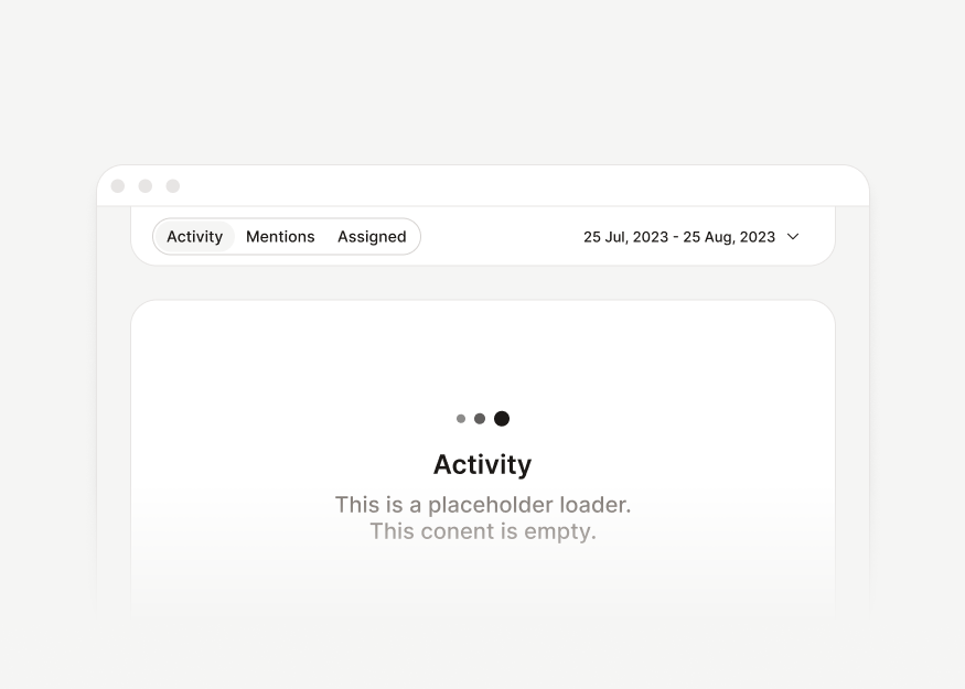
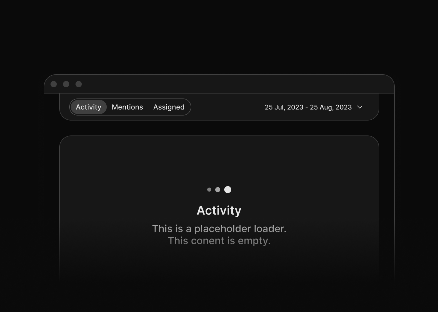
Chat Toolbars
2 components
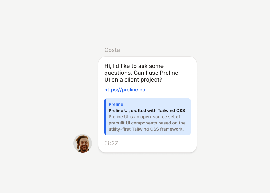
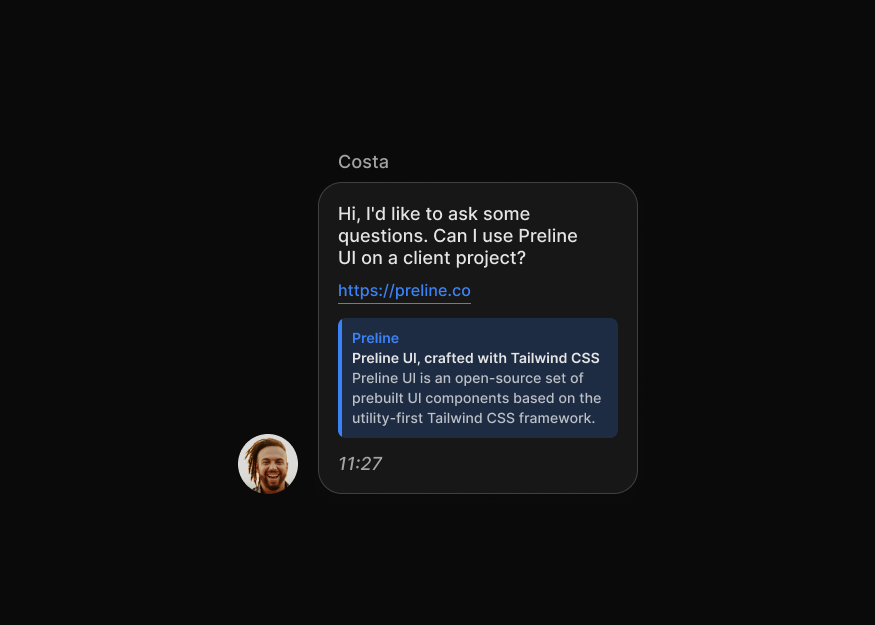
Message Bubbles
4 components


Media & Attachment Bubbles
6 components
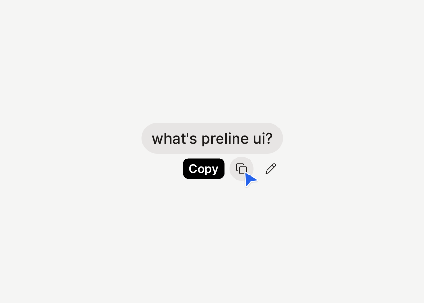
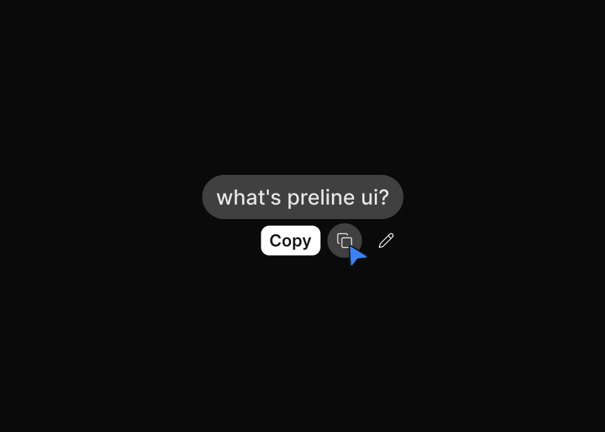
AI Chat Bubbles
2 components
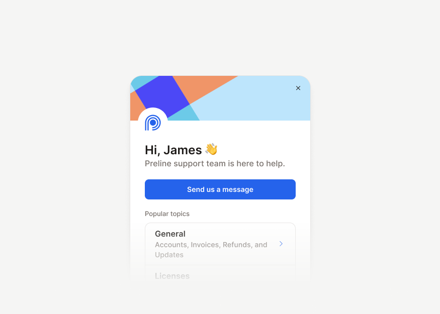
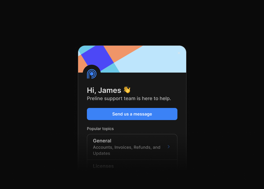
Support Chat Widgets
6 components


Support Chat Sidebars
1 components
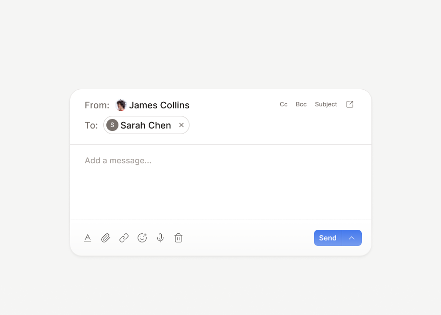
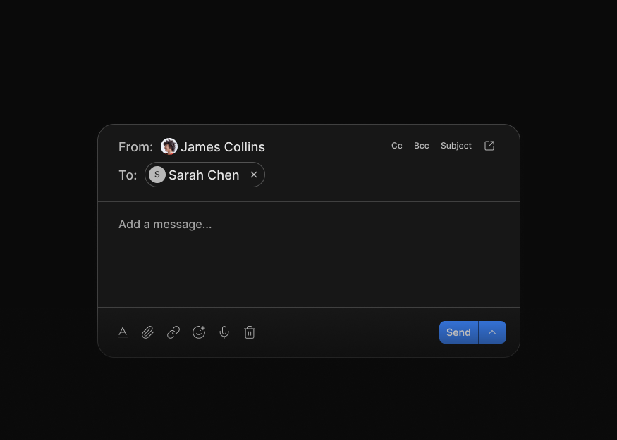
Inbox Threads
2 components
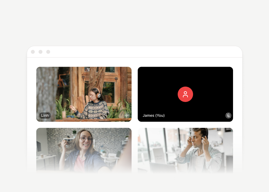

Video Call Layouts
4 components
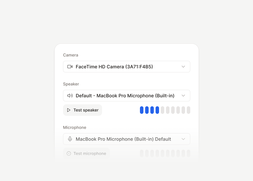
Call Device Settings
1 components
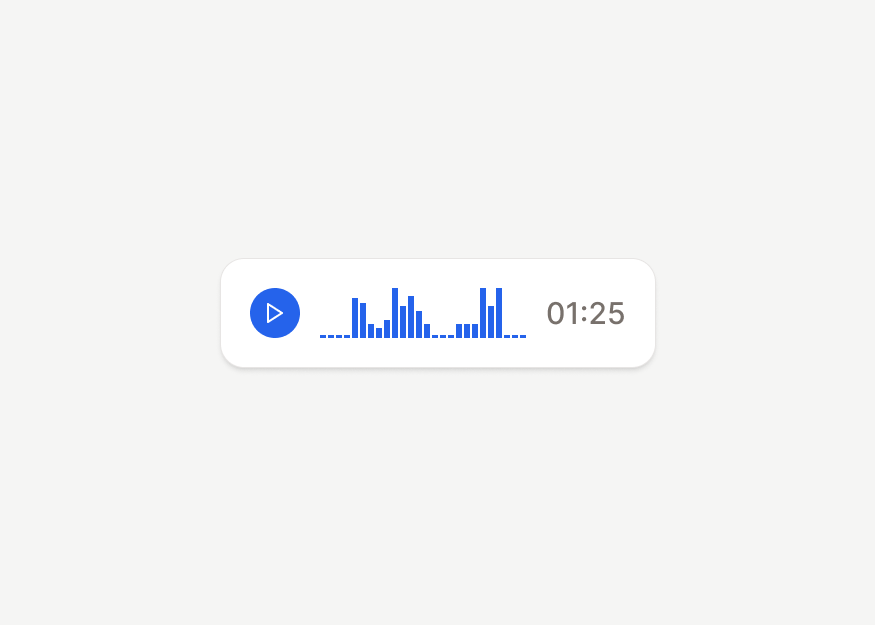
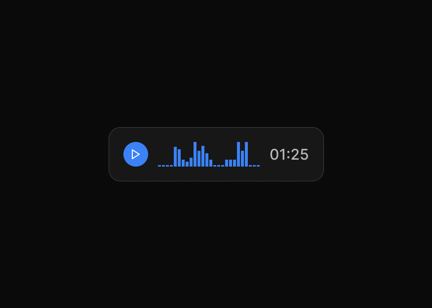
Voice Messages
3 components


Contact Cards
3 components


Connections & Selectors
3 components
Productivity
Calendars, schedules, planning boards, and task-management blocks for productivity and workflow applications.


Feedback & States
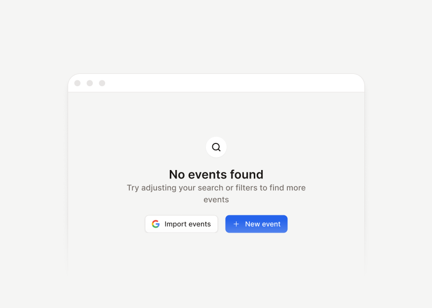
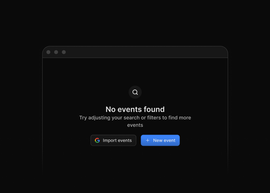
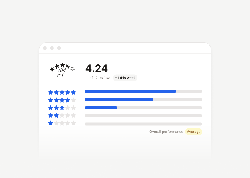
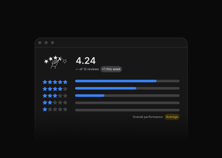
Empty states, notifications, success feedback, review flows, and product response patterns.




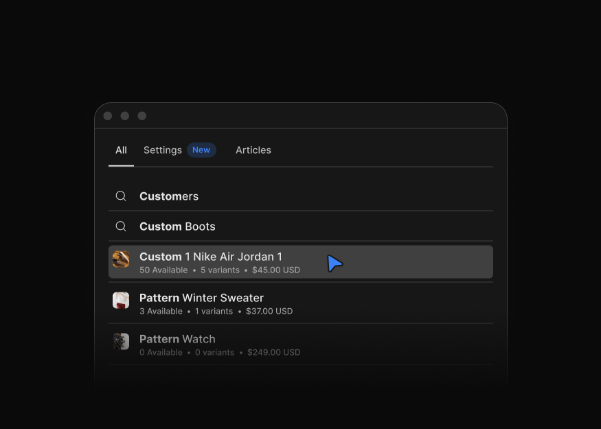
Search & Command
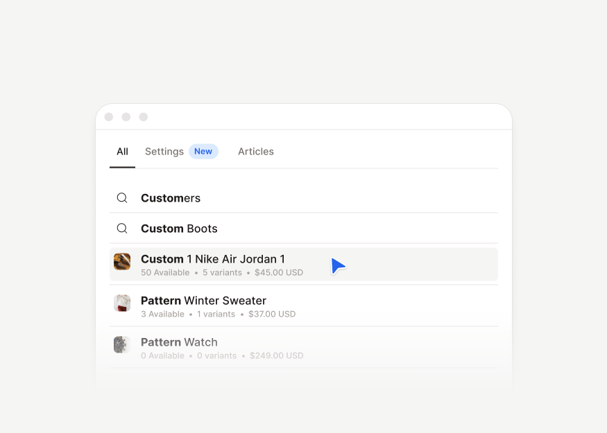
Search results, command launchers, action palettes, and keyboard-first discovery surfaces.
Modals
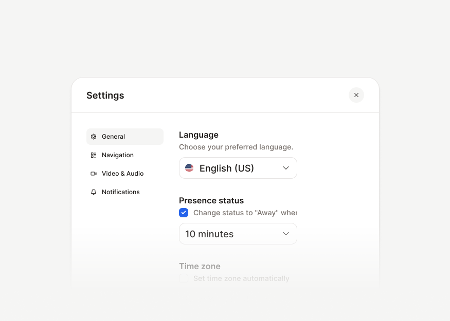
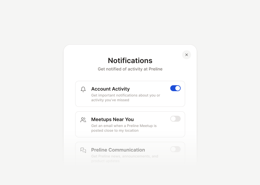
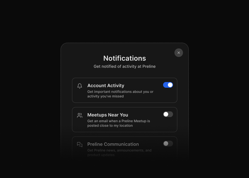
Task-focused modal dialogs for authentication, creation flows, billing, scheduling, settings, and product interactions.
Drawers
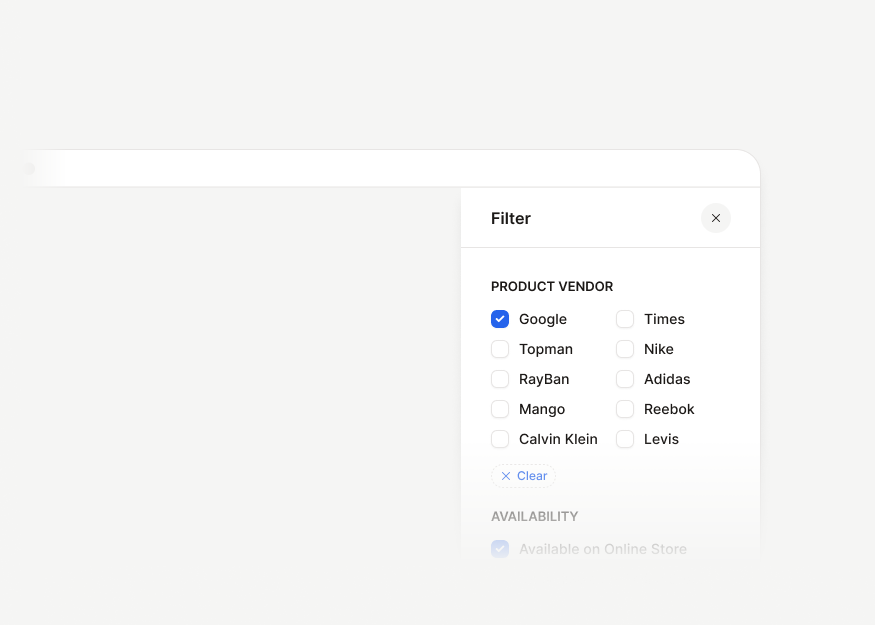
Offcanvas panels, detail drawers, and drawer-based filter surfaces for product utilities and contextual side panels.


UI Components
Menus, selects, buttons, badges, snippet cards, progress bars, and reusable interface controls.


Dropdown Menus
9 components
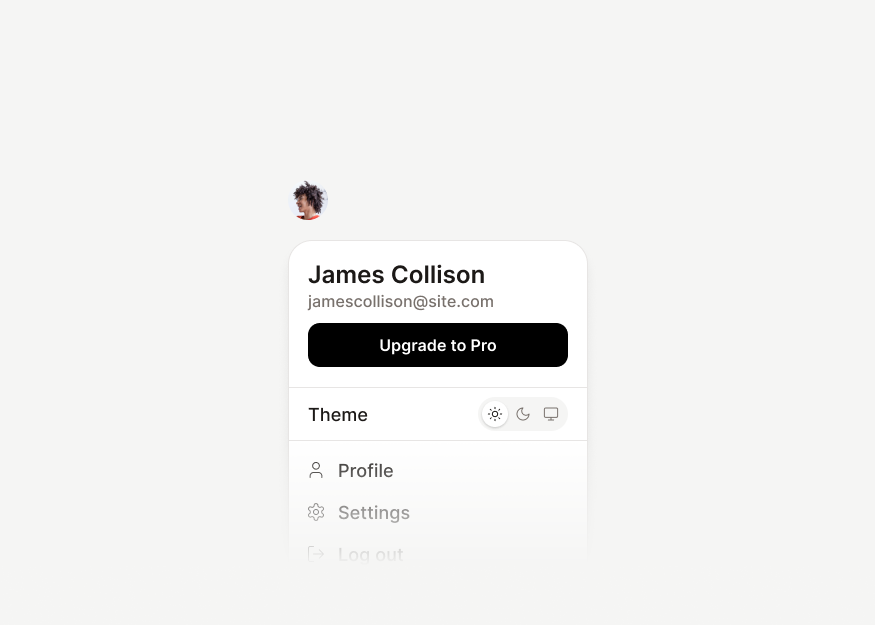
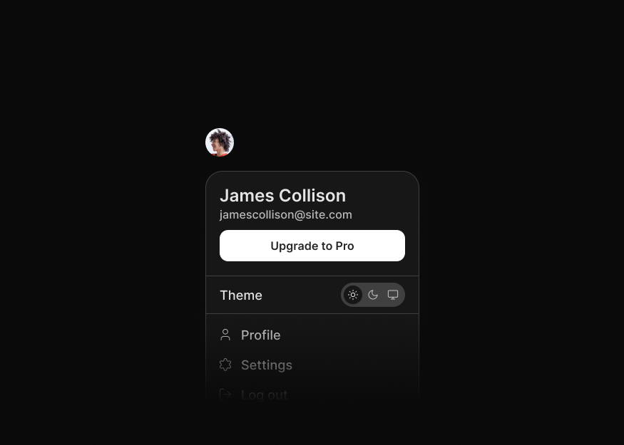
Account & Workspace Menus
8 components


Selection Menus
10 components


Select Menus New
13 components


Tagging Selects
2 components


Embedded & Compact Selects
4 components


Ecommerce Menus
4 components


Editor & Toolbar Menus
4 components


Profile Popovers
2 components


Buttons
9 components


Action Button Groups
6 components


Segmented Controls
3 components


Label & Feedback Groups
4 components


Badge Styles
8 components


Status Badges
4 components


Tag Chips
7 components


Progress Indicators
9 components


Utility Links
3 components
Navigation & Layout
Application navbars, dashboard headers, sidebars, toolbars, shells, and structural layouts for applications, dashboards, and internal tools.
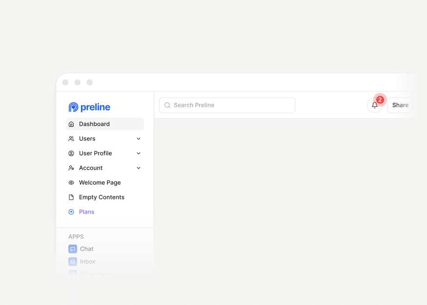
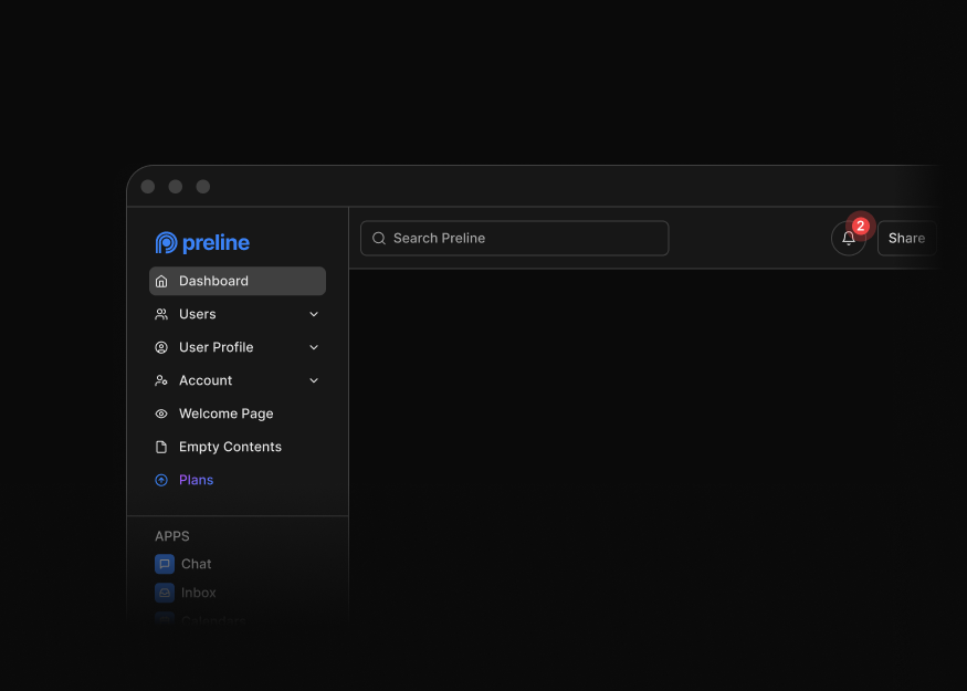
Dashboard Headers
7 components


Workspace Headers
12 components
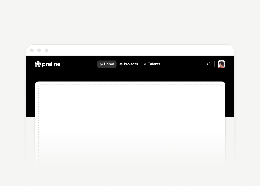
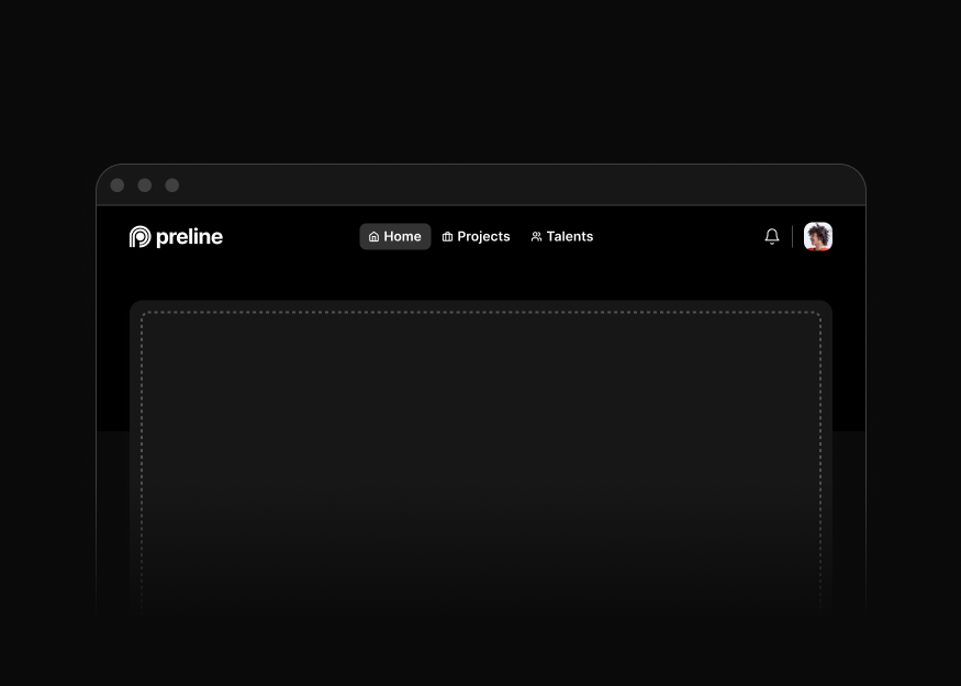
Application Navbars
6 components


Flow Headers
1 components


Secondary Navs
4 components


Scroll Navigation
2 components


Card Tabs
11 components


Dashboard Sidebars
6 components


Application Sidebars
5 components
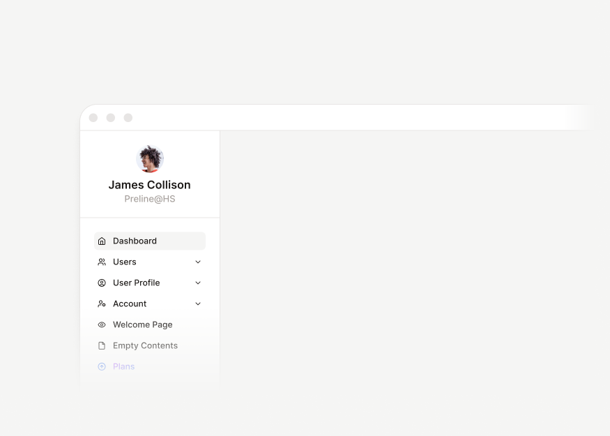
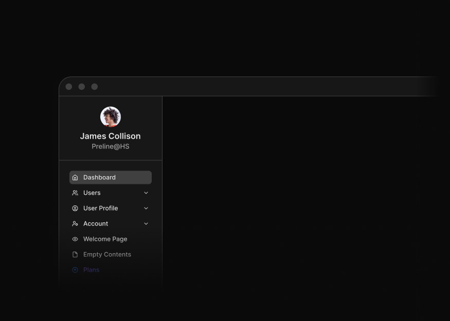
Dashboard Sidebar Modules
5 components
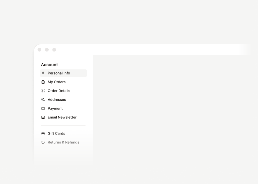
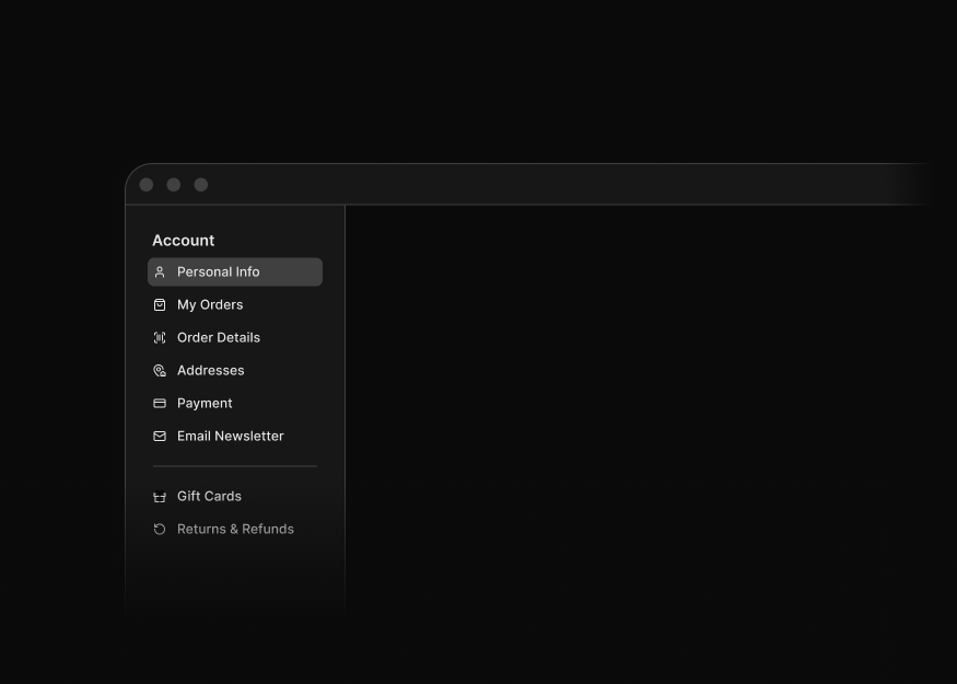
Sidebar Navigation
2 components


Multi-Panel Layouts New
7 components


Detached Sidebar Layouts
2 components


Dashboard Demo Layouts
4 components


Title Bars
17 components


Dashboard Footers
1 components


Stacked Footers
2 components


Blank & Error Pages
4 components


Sticky Layouts
2 components
Tailwind CSS Application UI Blocks FAQs
What are Tailwind CSS application UI blocks?
Application UI blocks are ready-made interface sections and screens for SaaS products, admin dashboards, internal tools, and other data-driven applications. They help you assemble common product workflows without starting every layout from scratch.
What types of application UI are included?
The collection includes charts, KPI cards, tables, forms, authentication, profiles, billing, communication, productivity, feedback states, command palettes, modals, drawers, navigation, and reusable interface controls.
Can I build a complete dashboard from these blocks?
Yes. Combine navigation and layout blocks with data display, forms, tables, feedback states, and task-focused overlays. Application page blocks can provide larger starting screens for profiles, settings, administration, and AI interfaces.
Do the blocks include live application data and backend logic?
No. The examples provide the interface structure, sample content, and relevant front-end interactions. Connect them to your own APIs, database, authentication, validation, permissions, and application state.
Are application UI blocks responsive and dark-mode ready?
Yes. The layouts use responsive Tailwind CSS utilities and include dark-mode styles where appropriate. Complex tables, sidebars, charts, and multi-panel screens should still be tested with your real data and target devices.
How are blocks different from UI components and application pages?
UI components are smaller controls such as menus, buttons, and badges. Blocks combine multiple elements into useful sections, while application pages provide larger screen-level compositions for complete product workflows.