- Overview
- About Preline UI
Overview
About Preline UI
Preline UI is an open-source Tailwind CSS components library for any needs. Comes with UI examples & blocks, templates, plugins, Figma design system and more.
Introduction
Preline UI is an open-source component library built on Tailwind CSS, designed to help developers build modern user interfaces faster while staying fully in control.
All components are created using standard Tailwind utility classes, allowing you to customize layouts, spacing, colors, and behavior without learning new abstractions or proprietary APIs. This ensures Preline UI fits naturally into existing Tailwind workflows and scales from simple projects to complex applications.
Starting from v4.0, Preline UI also includes optional themes that provide ready-made visual styles for convenience. These themes are entirely optional — you can use them as a starting point, customize them, or ignore them altogether and style components purely with utility classes.
Preline UI is designed to be flexible by default, giving you the freedom to choose how much styling and structure you want to adopt.
Why use Preline UI?
Preline UI addresses the need for speed and efficiency in UI development without sacrificing flexibility. As Tailwind CSS adoption grows, many developers and teams find themselves repeatedly building similar UI components or spending time on basic scaffolding.
Component libraries solve this by providing consistent, prebuilt building blocks. Preline UI focuses on enabling rapid interface assembly by offering ready-made, Tailwind-based components that can be copied and customized, instead of hand-coding every button, form, or layout from scratch. This approach accelerates development while maintaining design consistency and responsiveness out of the box.
Preline UI addresses these needs in several key ways:
-
Breadth of content:
Preline UI provides a broad collection of prebuilt components, example blocks, and pages, covering common UI patterns such as dashboards, landing pages, forms, modals, and more. This reduces the need to combine multiple smaller libraries to cover typical UI requirements.
For projects that require many different component types, using a comprehensive kit like Preline UI can significantly reduce setup and integration time. Developers can rely on a single, consistent system instead of piecing together disparate solutions.
Additionally, Preline Pro extends this offering with a larger collection of examples and templates, further accelerating development for more complex or content-heavy projects.
-
Rapid prototyping and MVPs:
Preline UI enables teams to move quickly in the early stages of a project by providing ready-made, Tailwind-based components that can be assembled into functional interfaces with minimal overhead.
This speed does not come at the expense of structure. Components are designed with scalability and maintainability in mind, allowing prototypes and MVPs to evolve into long-term products without requiring a full UI rewrite.
Preline Pro builds on this foundation by offering a more extensive set of examples and templates, supporting teams that need consistent, production-ready interfaces across larger and more complex applications.
This makes Preline UI suitable not only for early-stage development, but also for teams planning for growth, standardization, and long-term maintenance.
-
Design-development workflow:
Preline UI includes a Figma design system that mirrors its component library, enabling designers and developers to work from a shared set of building blocks. Designers can prototype interfaces in Figma using Preline components, while developers can implement the same components directly using Tailwind CSS.
This alignment between design and code helps reduce handoff friction, improves consistency, and increases fidelity between design mockups and the final implementation. Teams with both designers and developers benefit from a more predictable and efficient workflow built around a shared system.
The Preline Figma Design System focuses on providing a consistent component foundation rather than complete example pages, prioritizing design-system consistency over a Figma-first workflow.
-
Consistency and best practices:
Preline UI helps teams maintain visual and structural consistency by providing components that follow established UI patterns and Tailwind CSS best practices. Using shared components reduces duplication and minimizes inconsistencies that often emerge as projects grow.
By relying on a common set of components and conventions, teams can improve maintainability and onboarding, ensuring that new contributors can understand and extend the UI without introducing fragmentation.
Preline UI encourages consistency without enforcing rigid design constraints, allowing teams to adapt components to their own standards and preferences.
-
Avoiding lock-in:
Preline UI is built entirely with standard HTML, Tailwind CSS utility classes, and minimal JavaScript. It does not introduce proprietary syntax, custom build steps, or framework-specific abstractions.
Because components are copied directly into your project, you retain full ownership and control over the code. This makes it easy to adapt, refactor, or migrate components as your project evolves, without being tied to a specific runtime or ecosystem.
Preline UI can be used alongside any framework or tooling that supports Tailwind CSS, or even in projects without a framework at all.
In summary, Preline UI is a flexible, utility-first component library designed to help teams build modern interfaces faster while staying in control. It combines ready-made components, design-system alignment, and Tailwind CSS best practices without imposing rigid structures or mandatory proprietary constraints.
Whether you are prototyping quickly or building a long-term product, Preline UI provides a practical foundation that can scale with your project and adapt to your workflow.
What's in the box?
Here are the key advantages that Preline UI offers, broken down to their atomic benefits:
-
Extensive Components:
Preline UI contains hundreds of components (640+ and growing), covering almost any UI element a web project might need. This makes it one of the most comprehensive Tailwind-based component collections available.
-
Headless Tailwind CSS Plugins:
Preline UI includes in-house built 27 headless fully unstyled Tailwind JavaScript plugins.
-
Massive Set of Examples:
Preline provides 220+ examples and starter pages sections for free. These examples illustrate how to compose individual components into ready-to-use pages (dashboards, landing pages, auth pages, etc.).
-
Premium grade Templates:
Preline UI includes several free templates for dashboards, landing pages, and more as a starting point. Preline Pro extends this with a broader collection of templates, pages, and examples for more advanced use cases.
-
Figma Design System:
Preline UI includes a comprehensive Figma Design System that matches the components with over 30k+ downloads and 5 starts on various platforms.
-
Accessibility:
Preline UI is built with accessibility in mind. All components are designed to be accessible by default, with proper ARIA roles, attributes, keyboard support, and more.
-
Themes:
Preline UI includes a set of optional themes that can be used as a starting point for styling components.
-
Built-in Dark Mode Support:
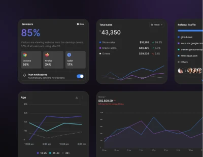
All components are built with dark mode compatibility out-of-the-box.
-
JSX Support:
Preline UI includes JSX copy code support for all components optionally to use in React projects. Please note that Preline UI does not include built-in React components, only JSX code snippets.
-
Agent Skills:
Preline UI includes Agent Skills that enable automated theme generation in agentic coding tools (e.g. IDEs, CLIs), helping teams accelerate setup and iteration.
Open Source & Community
Preline UI is actively maintained and regularly updated with new components, examples, and templates. You can follow its progress through the public changelog and GitHub activity. The project has nearly 6k GitHub stars and hundreds of resolved issues, supported by active discussions and community contributions.
You can join the Preline community on GitHub to suggest features, report issues, or contribute code: https://github.com/htmlstreamofficial/preline

