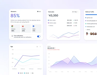
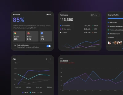
Tailwind CSS Charts
Charts are graphical representations used to showcase and simplify complex data sets, making information more comprehensible and visually appealing. They vary in types-from line to bar to pie-each highlighting specific data patterns and trends.
Requires Additional Installation
Note that this component requires the use of the third-party Apexcharts plugin. Preline uses ApexCharts v4.7, which was released before the June 2025 licensing change. Please review ApexCharts licensing terms if you plan to use newer versions.
Installation
-
Install Apexcharts
Install
apexchartsvia npmTerminalnpm i apexcharts -
Add the Apexcharts CSS
Include the CSS
<script>near the end of your</head>tag:HTML -
Add the Apexcharts JavaScript
Include the JavaScript
<script>near the end of your</body>tag:HTMLCertain JavaScript Helpers in Preline UI make use of Lodash plugin. Don't forget to install it, if you haven't done so already:
npm i lodash -
Add the Preline Helper JavaScript
Include the JavaScript
<script>after thehelper-apexcharts.jsfile. If you also need to use thevarToColorfunction, include thehelper-shared.jsfile as well.HTML
Single-series area chart
Use an area chart to show one data series with a filled region beneath the line.
Multi-series area chart
Plot multiple area series on the same axes to compare trends over the same period.
Synced area chart tooltips
Synchronize hover tooltips across two related area charts for side-by-side comparison.
Synced area chart tooltips (alt)
Use an alternative synced-tooltip layout when comparing two area charts with shared hover states.
Smoothed area chart
Use curve: 'smooth' to render softer area-chart lines and transitions.
Single-series bar chart
Use a bar chart to display one series across a set of categories.
Multi-series line chart
Compare several line series on the same chart to spot differences in trend.
Smoothed line chart
Use curve: 'smooth' to render line-chart paths with softer transitions.
Horizontal bar chart
Flip the bars horizontally when labels are long or when you want a ranking-style layout.
Doughnut chart
Use a doughnut chart to show how segments contribute to a whole while leaving room for center content.
Bubble chart
Use a bubble chart to compare values across two axes and a third value through bubble size.
Compact sparklines
Use small sparkline charts when you need compact trend indicators inside cards, tables, or dashboards.