Tailwind CSS Dropdown Plugin API
Headless, unstyled dropdown plugin built with JavaScript and TypeScript, including installation, usage, options, methods, events, and selectors.
Installation
To get started, install Dropdown plugin via npm, else you can skip this step if you are already using Preline UI as a package.
-
Install the plugin
Install
@preline/dropdownvia npmTerminalnpm i @preline/dropdown -
Add the plugin CSS
Use @source to register the plugin's JavaScript path for Tailwind CSS scanning, then @import the plugin's CSS files into your Tailwind CSS file.
main.css@import "tailwindcss"; /* @preline/dropdown */ /* [!code highlight:3] */ @source "../node_modules/@preline/dropdown/*.js"; @import "./node_modules/@preline/dropdown/variants.css"; @import "./node_modules/@preline/dropdown/theme.css"; -
Add the plugin JavaScript
Include the JavaScript
<script>that powers the interactive elements near the end of your</body>tag:HTML
Additional Initialization Options
Use the
non-autoentry if you need manual initialization. In this mode, automatic initialization on page load is not included, so the component should be initialized explicitly.HTML (non-auto)
Via bundler
When using a bundler (Vite, webpack, etc.), import the plugin directly as an ES module.
JavaScript (auto)import "@preline/dropdown";JavaScript (non-auto)import HSDropdown from "@preline/dropdown/non-auto"; HSDropdown.autoInit(); // Or initialize a specific element manually const el = document.querySelector("#dropdown"); if (el) new HSDropdown(el);
Example
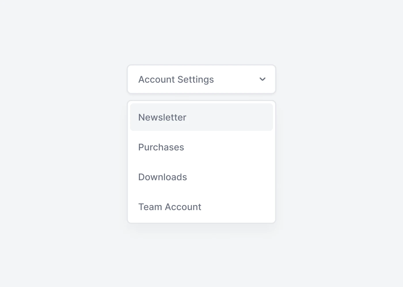
Wrap the dropdown's toggle (your button or link) and the dropdown menu within .relative, or another element that declares position: relative;. Dropdown can be triggered from <a> or <button> elements to better fit your potential needs.
Basic usage
Prefer to create your own style? Here is a completely unstylized example.
                        <div class="hs-dropdown relative inline-flex">
                          <button id="hs-dropdown-unstyled" type="button" class="hs-dropdown-toggle inline-flex justify-center items-center gap-x-2" aria-expanded="false" aria-label="Menu">
                            Actions
                          </button>

                          <div class="hs-dropdown-menu transition-[opacity,margin] duration hs-dropdown-open:opacity-100 opacity-0 w-56 hidden z-10 mt-2 min-w-60 bg-white" role="menu" aria-labelledby="hs-dropdown-unstyled">
                            <a class="block" href="#">Newsletter</a>
                            <a class="block" href="#">Purchases</a>
                            <a class="block" href="#">Downloads</a>
                            <a class="block" href="#">Team Account</a>
                          </div>
                        </div>
Methods
The HSDropdown object is contained within the global window object
Open item (public method).
                        const dropdown = new HSDropdown(document.querySelector('#dropdown'));
                        const openBtn = document.querySelector('#open-btn');

                        openBtn.addEventListener('click', () => {
                          dropdown.open();
                        });
Open item (static method).
                        const openBtn = document.querySelector('#open-btn');

                        openBtn.addEventListener('click', () => {
                          HSDropdown.open('#dropdown');
                        });
Open item (mixed).
                        const { element } = HSDropdown.getInstance('#dropdown', true);
                        const openBtn = document.querySelector('#open-btn');

                        openBtn.addEventListener('click', () => {
                          element.open();
                        });
Events
Call any function on open example.
                        const el = HSDropdown.getInstance('#dropdown');

                        el.on('open', (instance) => {...});
Ready to use Components
Looking for prebuilt UI components based on the Tailwind CSS? Preline UI packs hundreds of component examples for all your website needs.
Dropdown
Explore ready-to-use Tailwind CSS examples built with Preline UI.
View Dropdown examples