Tailwind CSS Select Plugin API
Headless, unstyled select plugin built with JavaScript and TypeScript, including installation, usage, options, methods, events, and selectors.
Installation
To get started, install Select plugin via npm, else you can skip this step if you are already using Preline UI as a package.
-
Install the plugin
Install
@preline/selectvia npmTerminalnpm i @preline/selectSome positioning features require Floating UI. Install it if you plan to use
dropdownScope: "window",dropdownPlacement, ordropdownAutoPlacement:npm i @floating-ui/dom -
Add the plugin CSS
Use @source to register the plugin's JavaScript path for Tailwind CSS scanning, then @import the plugin's CSS files into your Tailwind CSS file.
main.css@import "tailwindcss"; /* @preline/select */ /* [!code highlight:3] */ @source "../node_modules/@preline/select/*.js"; @import "./node_modules/@preline/select/variants.css"; @import "./node_modules/@preline/select/theme.css"; -
Add the plugin JavaScript
Include the JavaScript
<script>that powers the interactive elements near the end of your</body>tag. If you usedropdownScope: "window",dropdownPlacement, ordropdownAutoPlacement, also load the Floating UI UMD bundle before the plugin — it exposes theFloatingUIDOMglobal the plugin relies on:HTML
Additional Initialization Options
Use the
non-autoentry if you need manual initialization. In this mode, automatic initialization on page load is not included, so the component should be initialized explicitly.HTML (non-auto)
Via bundler
When using a bundler (Vite, webpack, etc.), import the plugin directly as an ES module. If you use
dropdownScope: "window",dropdownPlacement, ordropdownAutoPlacement, exposeFloatingUIDOMonwindowbefore importing the plugin.JavaScript (auto)// Optional: required for dropdownScope: "window", dropdownPlacement, dropdownAutoPlacement // [!code highlight:2] import * as FloatingUIDOM from "@floating-ui/dom"; window.FloatingUIDOM = FloatingUIDOM; import "@preline/select";JavaScript (non-auto)// Optional: required for dropdownScope: "window", dropdownPlacement, dropdownAutoPlacement // [!code highlight:2] import * as FloatingUIDOM from "@floating-ui/dom"; window.FloatingUIDOM = FloatingUIDOM; import HSSelect from "@preline/select/non-auto"; HSSelect.autoInit(); // Or initialize a specific element manually const el = document.querySelector("#select"); if (el) new HSSelect(el);
Basic usage
Prefer to create your own style? Here is a completely unstylized example.
                        <select data-hs-select='{
                            "placeholder": "Select option...",
                            "toggleTag": "<button type=\"button\"></button>",
                            "toggleClasses": "",
                            "dropdownClasses": "",
                            "optionClasses": "hs-selected:"
                          }'>
                          <option>Select option</option>
                          <option>Name</option>
                          <option>Email address</option>
                          <option>Description</option>
                          <option>User ID</option>
                        </select>
Methods
The HSSelect object is contained within the global window object
Set value.
                        const select = HSSelect.getInstance('#select');
                        const setValueBtn = document.querySelector('#set-value-btn');

                        setValueBtn.addEventListener('click', () => {
                          select.setValue('address');
                          // if select is multiple
                          // select.setValue(['address', 'email']);
                        });
Open item (public method).
                        const select = new HSSelect(document.querySelector('#select'));
                        const openBtn = document.querySelector('#open-btn');

                        openBtn.addEventListener('click', () => {
                          select.open();
                        });
Open item (static method).
                        const openBtn = document.querySelector('#open-btn');

                        openBtn.addEventListener('click', () => {
                          HSSelect.open('#select');
                        });
Open item (mixed).
                        const { element } = HSSelect.getInstance('#select', true);
                        const openBtn = document.querySelector('#open-btn');

                        openBtn.addEventListener('click', () => {
                          element.open();
                        });
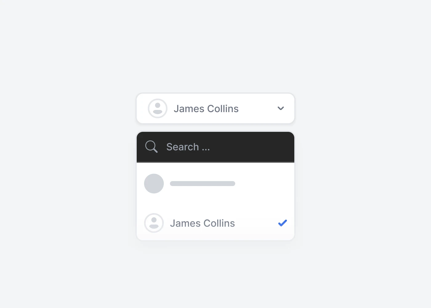
Add options (public method).
                        const select = window.HSSelect.getInstance('#select');
                        const addOptionsBtn = document.querySelector('#add-options');

                        addOptionsBtn.addEventListener('click', () => {
                          select.addOption([
                            {
                              title: "James Collins",
                              val: "1",
                              options: {
                                icon: `<img class="inline-block size-6 rounded-full" src="https://images.unsplash.com/photo-1659482633369-9fe69af50bfb?ixlib=rb-4.0.3&ixid=MnwxMjA3fDB8MHxwaG90by1wYWdlfHx8fGVufDB8fHx8&auto=format&fit=facearea&facepad=3&w=320&h=320&q=80" alt="James Collins 2" />`
                              }
                            },
                            {
                              title: "Amanda Harvey",
                              val: "2",
                              options: {
                                icon: `<img class="inline-block size-6 rounded-full" src="https://images.unsplash.com/photo-1541101767792-f9b2b1c4f127?ixlib=rb-4.0.3&ixid=MnwxMjA3fDB8MHxwaG90by1wYWdlfHx8fGVufDB8fHx8&auto=format&fit=facearea&facepad=3&w=320&h=320&q=80" alt="Amanda Harvey" />`
                              }
                            }
                          ]);
                        });
Remove options (public method).
                        const select = window.HSSelect.getInstance('#select');
                        const removeOptionsBtn = document.querySelector('#remove-options');

                        removeOptionsBtn.addEventListener('click', () => {
                          select.removeOption(["1", "2"]);
                        });
Destroy select (public method).
                        const select = window.HSSelect.getInstance('#select');
                        const destroySelectBtn = document.querySelector('#destroy-select');

                        destroySelectBtn.addEventListener('click', () => {
                          select.destroy();
                        });
Events
When select changes event example.
                        const el = HSSelect.getInstance('#select');

                        el.on('change', (val) => {...});
Ready to use Components
Looking for prebuilt UI components based on the Tailwind CSS? Preline UI packs hundreds of component examples for all your website needs.
Advanced Select
Explore ready-to-use Tailwind CSS examples built with Preline UI.
View Advanced Select examples