Tailwind CSS Collapse Plugin API
Headless, unstyled collapse plugin built with JavaScript and TypeScript, including installation, usage, options, methods, events, and selectors.
Installation
To get started, install Collapse plugin via npm, else you can skip this step if you are already using Preline UI as a package.
-
Install the plugin
Install
@preline/collapsevia npmTerminalnpm i @preline/collapse -
Add the plugin CSS
Use @source to register the plugin's JavaScript path for Tailwind CSS scanning, then @import the plugin's CSS files into your Tailwind CSS file.
main.css@import "tailwindcss"; /* @preline/collapse */ /* [!code highlight:3] */ @source "../node_modules/@preline/collapse/*.js"; @import "./node_modules/@preline/collapse/variants.css"; @import "./node_modules/@preline/collapse/theme.css"; -
Add the plugin JavaScript
Include the JavaScript
<script>that powers the interactive elements near the end of your</body>tag:HTML
Additional Initialization Options
Use the
non-autoentry if you need manual initialization. In this mode, automatic initialization on page load is not included, so the component should be initialized explicitly.HTML (non-auto)
Via bundler
When using a bundler (Vite, webpack, etc.), import the plugin directly as an ES module.
JavaScript (auto)import "@preline/collapse";JavaScript (non-auto)import HSCollapse from "@preline/collapse/non-auto"; HSCollapse.autoInit(); // Or initialize a specific element manually const el = document.querySelector("#collapse"); if (el) new HSCollapse(el);
Basic usage
Prefer to create your own style? Here is a completely unstylized example.
                        <button type="button" class="hs-collapse-toggle" id="hs-unstyled-collapse" aria-expanded="false" aria-controls="#hs-unstyled-collapse-heading" data-hs-collapse="#hs-unstyled-collapse-heading" role="region">
                          Collapse
                        </button>
                        <div id="hs-unstyled-collapse-heading" class="hs-collapse hidden w-full overflow-hidden transition-[height] duration-300" aria-labelledby="hs-unstyled-collapse">
                          This is a collapse body. It is hidden by default, until the collapse plugin adds the appropriate classes that we use to style each element. These classes control the overall appearance, as well as the showing and hiding via CSS transitions.
                        </div>
Methods
The HSCollapse object is contained within the global window object
Open item (public method).
                        const collapse = new HSCollapse(document.querySelector('#collapse'));
                        const showBtn = document.querySelector('#show-btn');

                        showBtn.addEventListener('click', () => {
                          collapse.show();
                        });
Open item (static method).
                        const showBtn = document.querySelector('#show-btn');

                        showBtn.addEventListener('click', () => {
                          HSCollapse.show('#collapse');
                        });
Open item (mixed).
                        const { element } = HSCollapse.getInstance('#collapse', true);
                        const showBtn = document.querySelector('#show-btn');

                        showBtn.addEventListener('click', () => {
                          element.show();
                        });
Events
Open any item event example.
                        const el = HSCollapse.getInstance('#collapse');

                        el.on('open', (el) => {...});
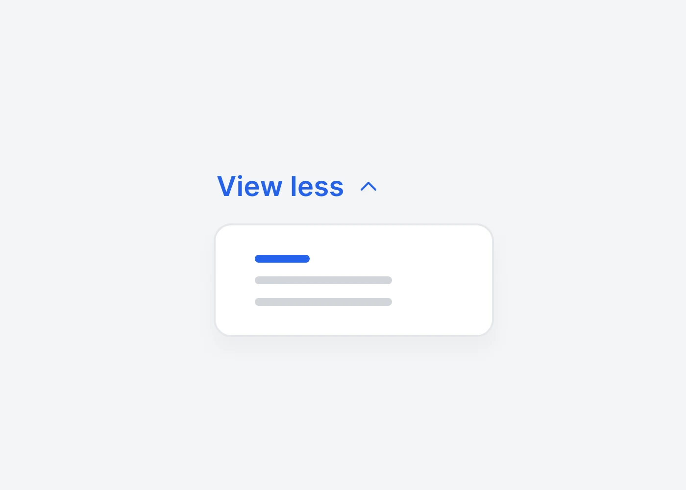
Ready to use Components
Looking for prebuilt UI components based on the Tailwind CSS? Preline UI packs hundreds of component examples for all your website needs.
Collapse
Explore ready-to-use Tailwind CSS examples built with Preline UI.
View Collapse examples