Tailwind CSS Theme Switch Plugin API
Headless, unstyled theme switch plugin built with JavaScript and TypeScript, including installation, usage, options, methods, events, and selectors.
Installation
To get started, install Theme Switch plugin via npm, else you can skip this step if you are already using Preline UI as a package.
-
Install the plugin
Install
@preline/theme-switchvia npmTerminalnpm i @preline/theme-switch -
Add the plugin CSS
Use @source to register the plugin's JavaScript path for Tailwind CSS scanning, then @import the plugin's CSS files into your Tailwind CSS file.
main.css@import "tailwindcss"; /* @preline/theme-switch */ /* [!code highlight:3] */ @source "../node_modules/@preline/theme-switch/*.js"; @import "./node_modules/@preline/theme-switch/variants.css"; @import "./node_modules/@preline/theme-switch/theme.css"; -
Add the plugin JavaScript
Include the JavaScript
<script>that powers the interactive elements near the end of your</body>tag:HTML
Additional Initialization Options
Use the
non-autoentry if you need manual initialization. In this mode, automatic initialization on page load is not included, so the component should be initialized explicitly.HTML (non-auto)
Via bundler
When using a bundler (Vite, webpack, etc.), import the plugin directly as an ES module.
JavaScript (auto)import "@preline/theme-switch";JavaScript (non-auto)import HSThemeSwitch from "@preline/theme-switch/non-auto"; HSThemeSwitch.autoInit(); // Or initialize a specific element manually const el = document.querySelector("#theme-switch"); if (el) new HSThemeSwitch(el);
Toggling dark mode manually
To enable manual toggling of dark mode instead of relying on the operating system preference, use Tailwind's @custom-variant strategy:
                          @import "tailwindcss";

                          @custom-variant dark (&:where(.dark, .dark *));

                          ...
How you add the dark class to the html element is up to you, but a common approach is to use a bit of JS that reads a preference from somewhere (like localStorage) and updates the DOM accordingly.
For more information, visit Tailwind CSS Dark Mode
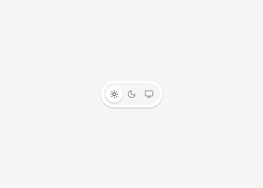
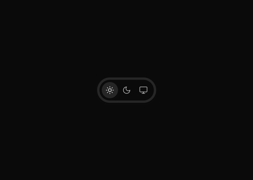
Basic usage
Prefer to create your own style? Here is a completely unstylized example.
                        <button type="button" class="hs-dark-mode hs-dark-mode-active:hidden block" data-hs-theme-click-value="dark">
                          Dark
                        </button>
                        <button type="button" class="hs-dark-mode hs-dark-mode-active:inline-flex hidden" data-hs-theme-click-value="light">
                          Light
                        </button>
Methods
The HSThemeSwitch object is contained within the global window object
Destroy instance.
                        const { element } = HSThemeSwitch.getInstance('#theme-switch', true);
                        const destroyBtn = document.querySelector('#destroy-btn');

                        destroyBtn.addEventListener('click', () => {
                          element.destroy();
                        });
Events
When appearance was changed.
                        window.addEventListener('on-hs-appearance-change', () => {
                          ...your code
                        });
Ready to use Components
Looking for prebuilt UI components based on the Tailwind CSS? Preline UI packs hundreds of component examples for all your website needs.
Theme Switch (Darkmode)
Explore ready-to-use Tailwind CSS examples built with Preline UI.
View Theme Switch (Darkmode) examples