Update v4.2 - New components, 10+ framework guides, and quality improvements. Visit Changelog

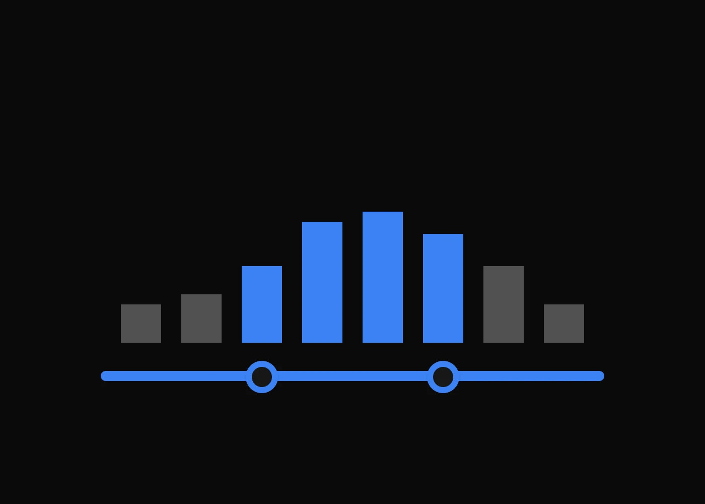
Tailwind CSS Range Slider Plugin API

Headless, unstyled range slider plugin built with JavaScript and TypeScript, including installation, usage, options, methods, events, and selectors.

JavaScript Typescript

Installation

To get started, install Range Slider plugin via npm, else you can skip this step if you are already using Preline UI as a package.

  1. Install the plugin

    Install @preline/range-slider via npm

    Terminal
                              
                                npm i nouislider @preline/range-slider
                              
                            
  2. Add the plugin CSS

    Use @source to register the plugin's JavaScript path for Tailwind CSS scanning, then @import the plugin's CSS files into your Tailwind CSS file.

    main.css
                              
                                @import "tailwindcss";
    
                                /* @preline/range-slider */
                                /* [!code highlight:3] */
                                @source "../node_modules/@preline/range-slider/*.js";
                                @import "./node_modules/@preline/range-slider/variants.css";
                                @import "./node_modules/@preline/range-slider/theme.css";
                              
                            
  3. Add the plugin JavaScript

    Include the JavaScript <script> that powers the interactive elements near the end of your </body> tag:

    HTML


    Additional Initialization Options

    Use the non-auto entry if you need manual initialization. In this mode, automatic initialization on page load is not included, so the component should be initialized explicitly.

    HTML (non-auto)


    Via bundler

    When using a bundler (Vite, webpack, etc.), import the plugin directly as an ES module. noUiSlider is referenced as a global — expose it on window before importing the plugin.

    JavaScript (auto)
                              
                                import * as noUiSlider from "nouislider";
                                window.noUiSlider = noUiSlider;
    
                                import "@preline/range-slider";
                              
                            
    JavaScript (non-auto)
                              
                                import * as noUiSlider from "nouislider";
                                window.noUiSlider = noUiSlider;
    
                                import HSRangeSlider from "@preline/range-slider/non-auto";
    
                                HSRangeSlider.autoInit();
    
                                // Or initialize a specific element manually
                                const el = document.querySelector("#range-slider");
                                if (el) new HSRangeSlider(el);


Example

Here is a basic example of a Range Slider.

Basic usage

Prefer to create your own style? Here is a completely unstylized example.

HTML


Data Options

Name Description Options Default value
data-hs-range-slider Activate a Range Slider by specifying on an element. Should be added to the initialized element. Since our plugin is an extension of the noUiSlider plugin, all its options can be passed as parameters to our plugin.
:disabled Makes the element unavailable for interaction. boolean false
:formatter Output value formatting options. string | object
:formatter:type Defines an output formatter type. "integer" | "thousandsSeparatorAndDecimalPoints" | null null
:formatter:prefix Adds a prefix to the output. string
:formatter:postfix Adds a postfix to the output. string

Tailwind Modifiers

Name Description
hs-range-slider-disabled:* A modifier that allows you to set Tailwind classes when slider has "disabled" attribute set to "true".

Methods

The HSRangeSlider object is contained within the global window object

Method Description
Public methods
formattedValue() Returns the current values formatted using the formatter option.
destroy() Destroys the instance, removes generated markup (if any), removes added classes and attributes.
Static methods
HSRangeSlider.getInstance(target, isInstance) Returns the element associated to the target.
  • target should be a Node or string (valid selector)
  • isInstance boolean. Returns the instance instead of Node if true

Events

noUiSlider Events

Note that all events available in the noUiSlider plugin are also available in our plugin, just use el.noUiSLider to handle events.

Method Description Returning value
on:update Called when any item was selected.
[integer, integer?]

When slider updates event example.

JavaScript
                      
                        const { element } = HSRangeSlider.getInstance('#range-slider', true);

                        element.el.noUiSlider.on('update', (values) => {
                          console.log(element.formattedValue);
                        });


Ready to use Components

Looking for prebuilt UI components based on the Tailwind CSS? Preline UI packs hundreds of component examples for all your website needs.

Advanced Range Slider

Explore ready-to-use Tailwind CSS examples built with Preline UI.

View Advanced Range Slider examples

Advanced Range Slider

© 2026 Preline Labs.