Tailwind CSS Blog & Articles Blocks
Editorial detail pages, blog listing sections, and editorial layouts for content marketing sites, magazines, knowledge bases, and publishing workflows.
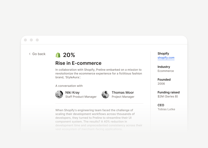
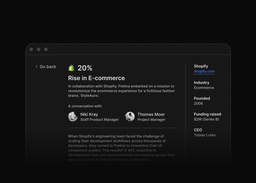
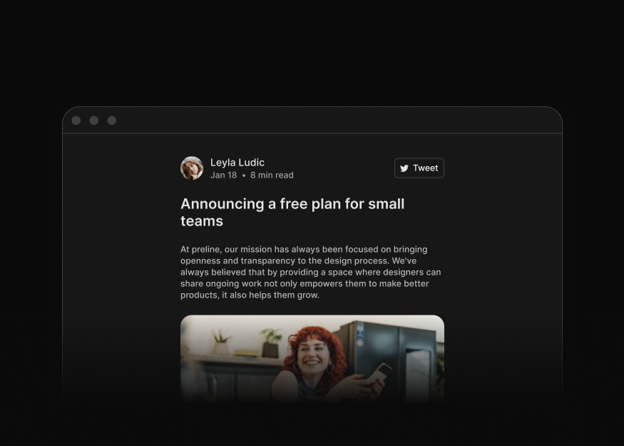
Editorial Pages
Customer stories, job details, case studies, and long-form reading experiences for editorial sites, product blogs, and publications.

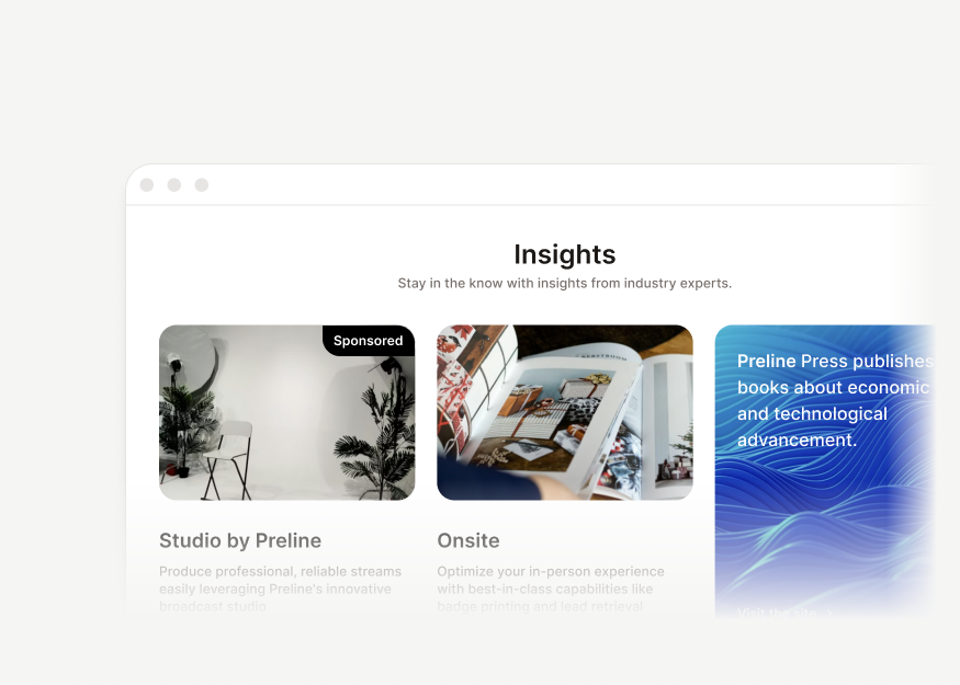
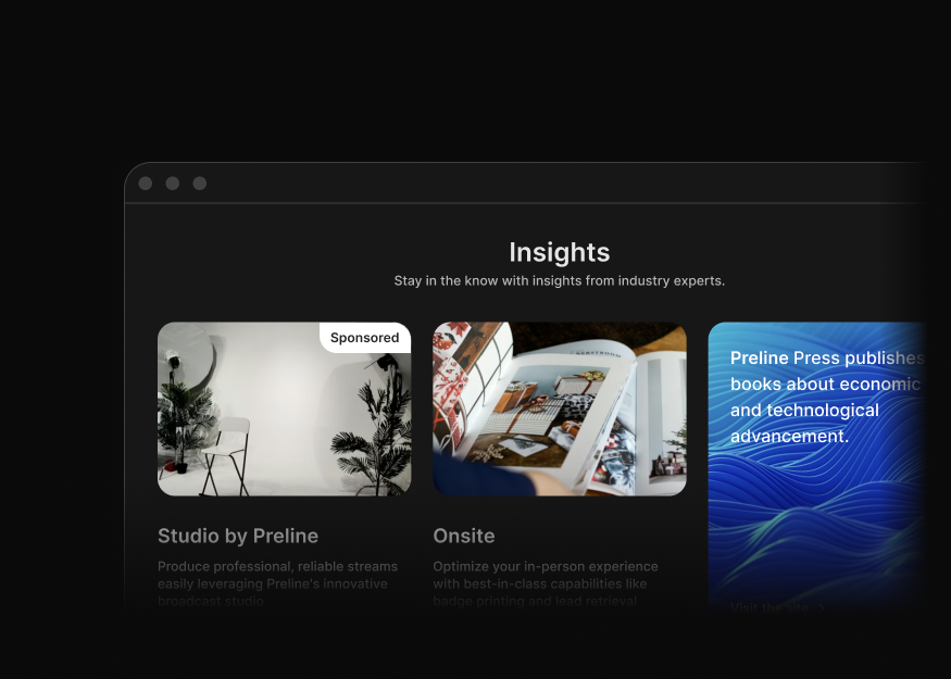
Blog Discovery & Sections
Blog teasers, post grids, and discovery modules for category pages, homepages, and content feeds.