Headless Tailwind CSS Plugins
Headless, unstyled Tailwind CSS plugins built with JavaScript and TypeScript to power accessible modals, dropdowns, tabs, steppers, advanced forms, and more.
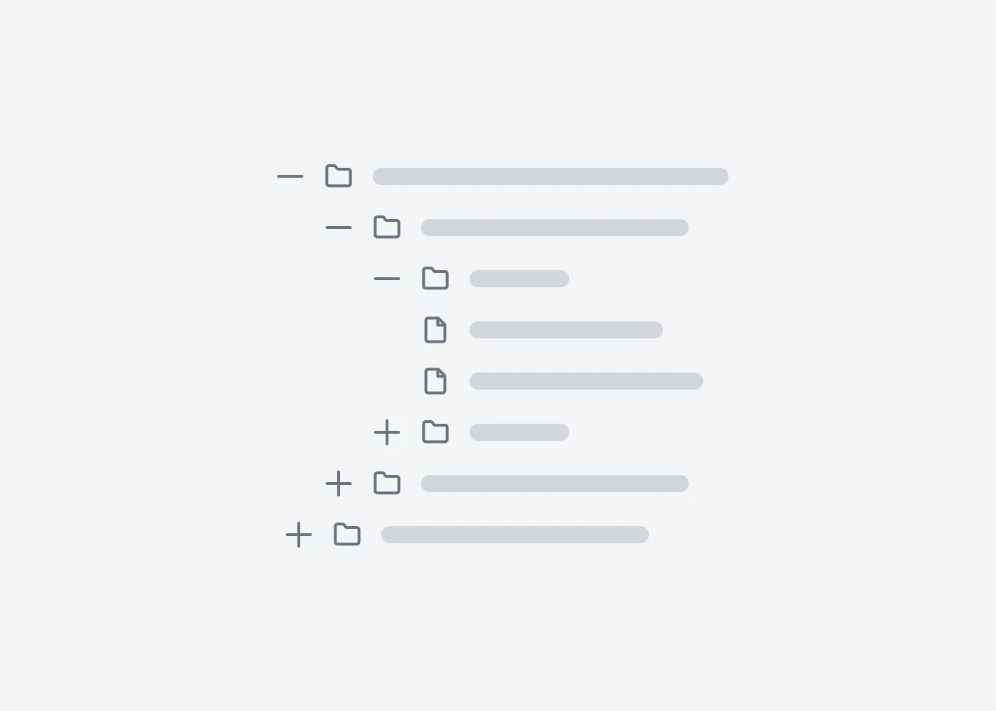
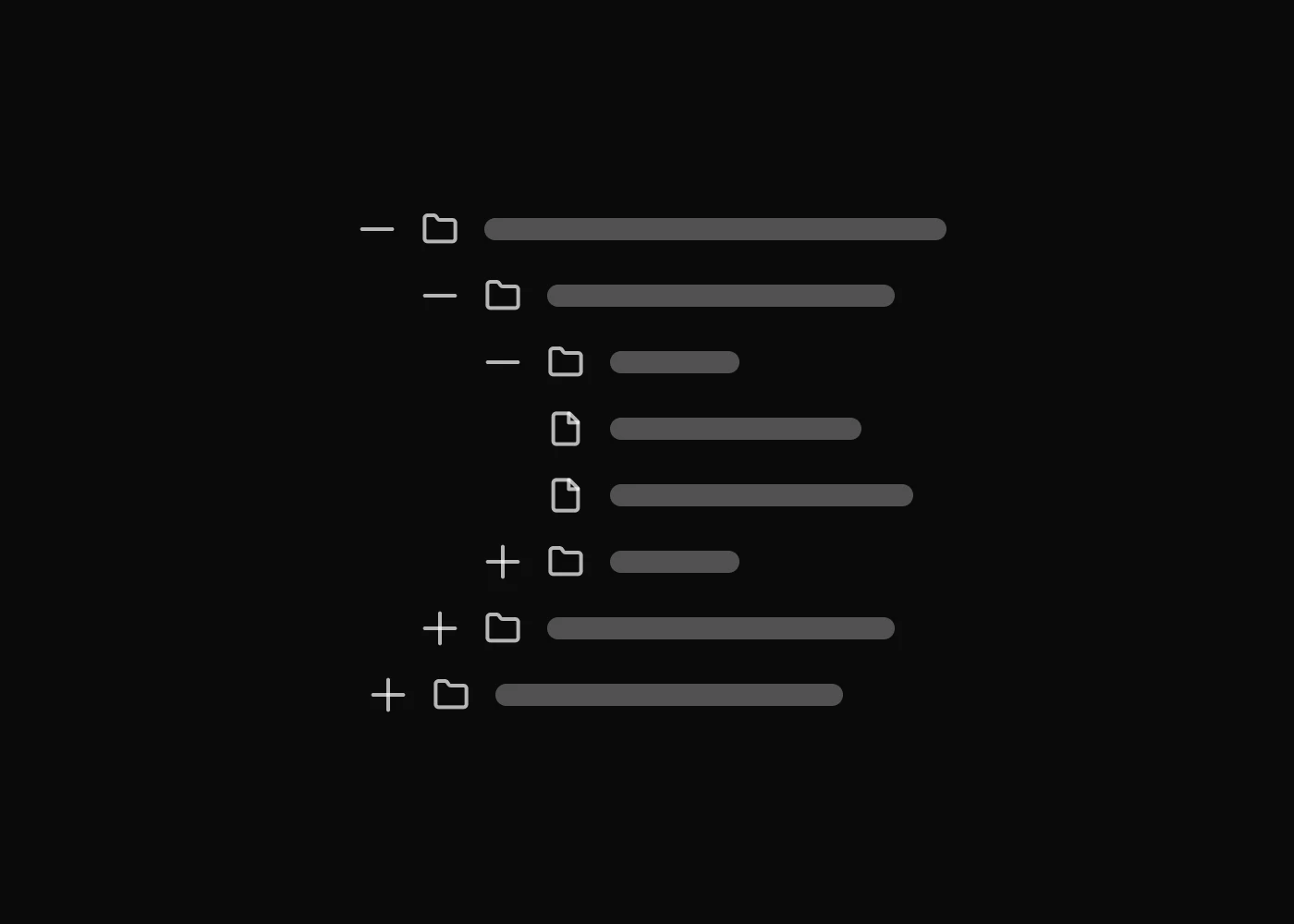
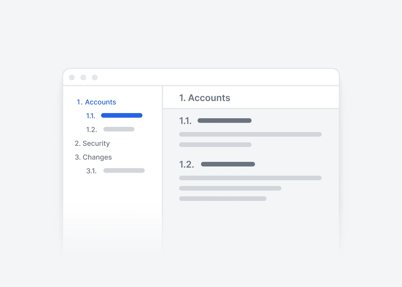
Disclosure
Accessible Tailwind CSS disclosure plugins for accordions, collapsible sections, and tree view navigation used in dashboards, docs, FAQs, and application interfaces.
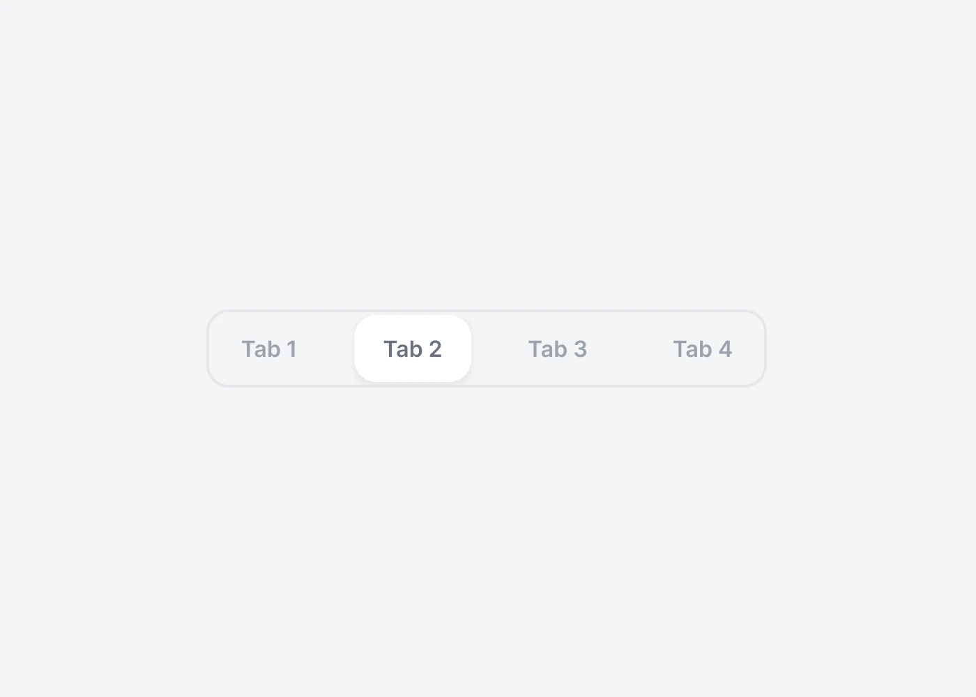
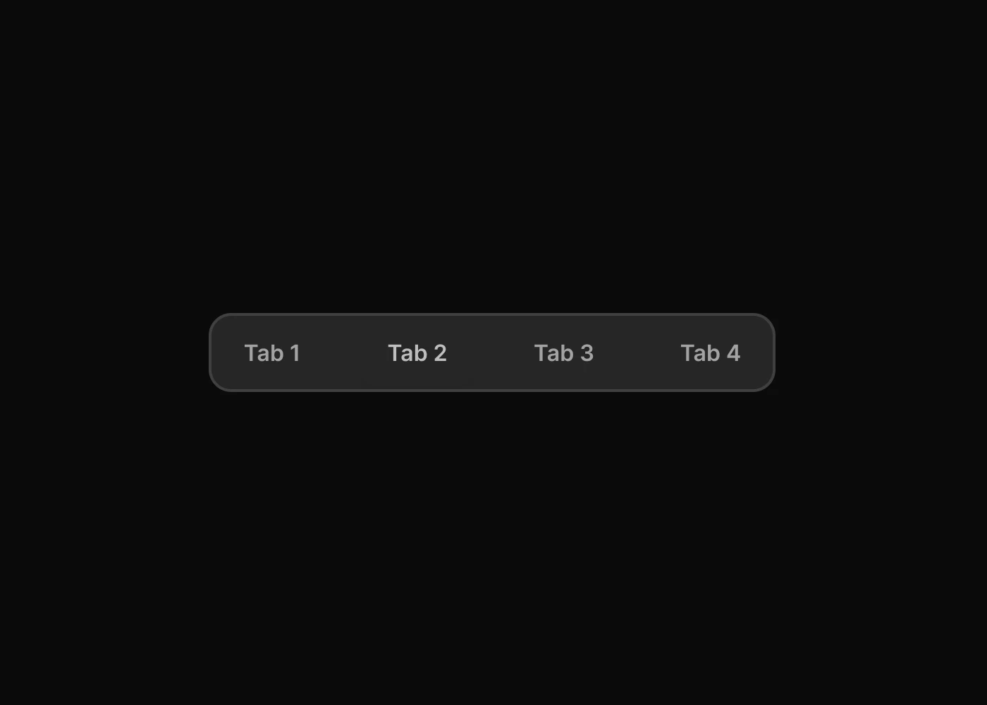
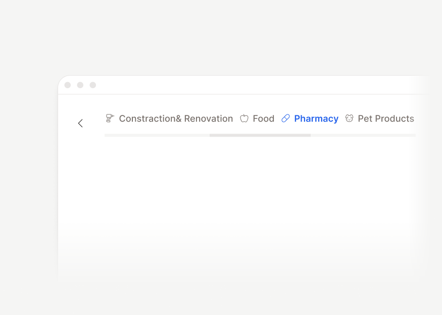
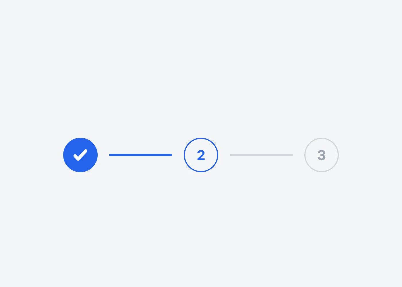
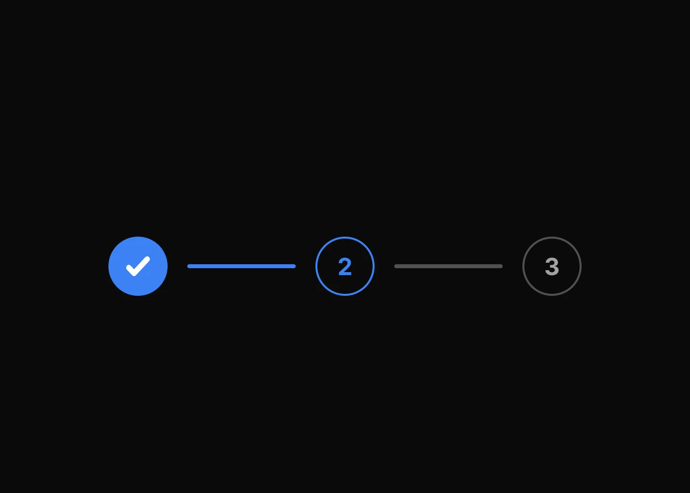
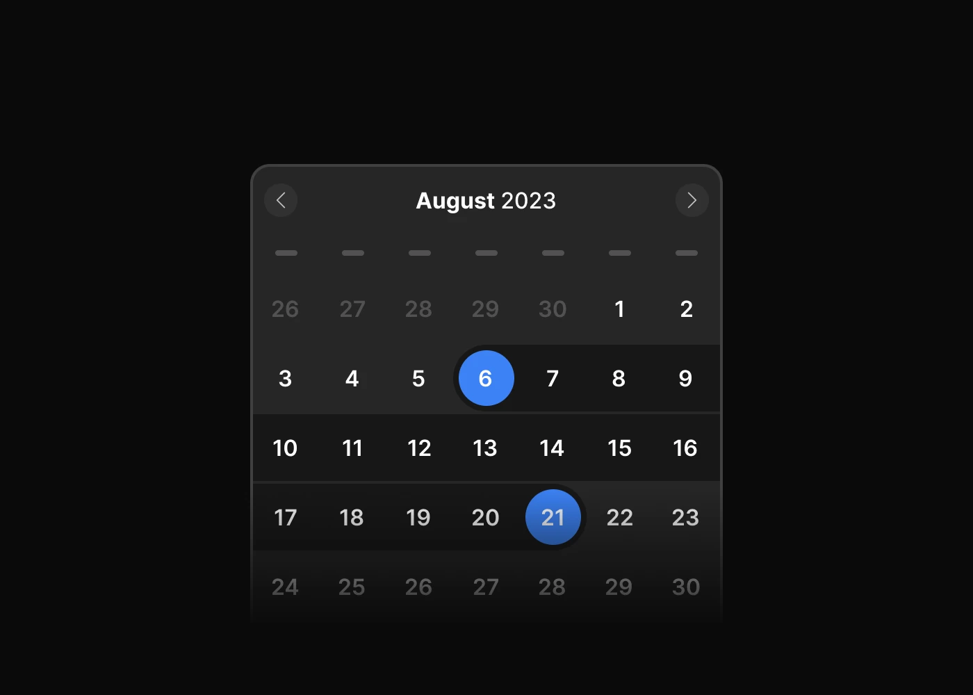
Navigations
Headless Tailwind CSS navigation plugins for tabs, scrollspy, scroll nav, and stepper flows across product walkthroughs, docs navigation, and multi-step forms.
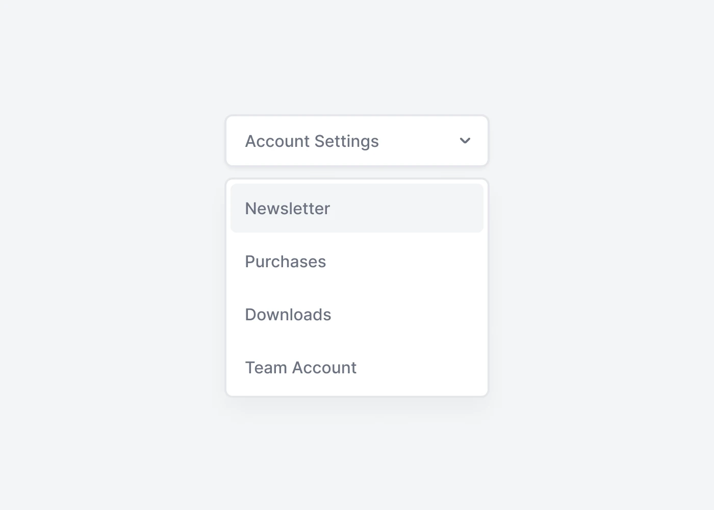
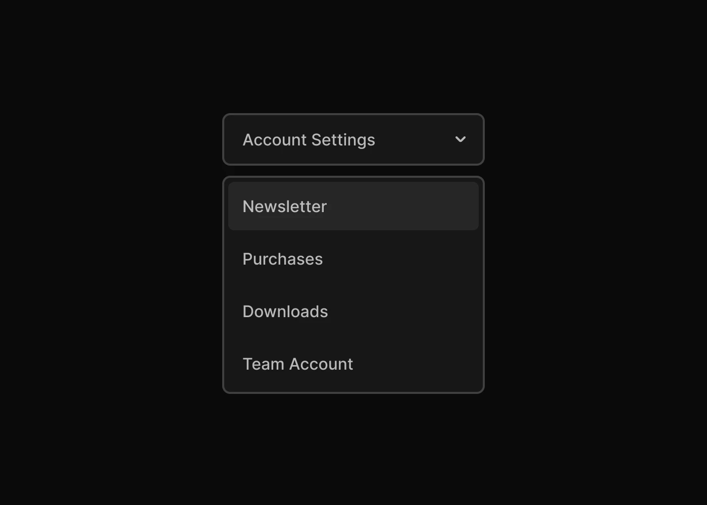
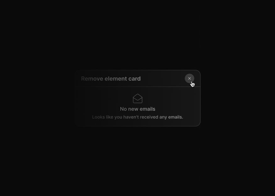
Overlays
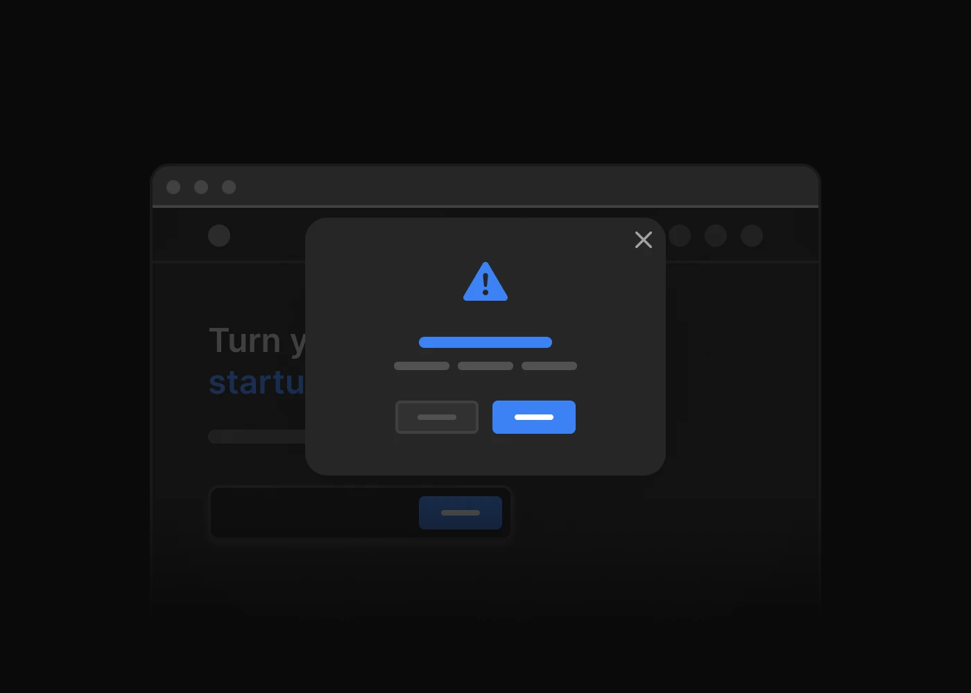
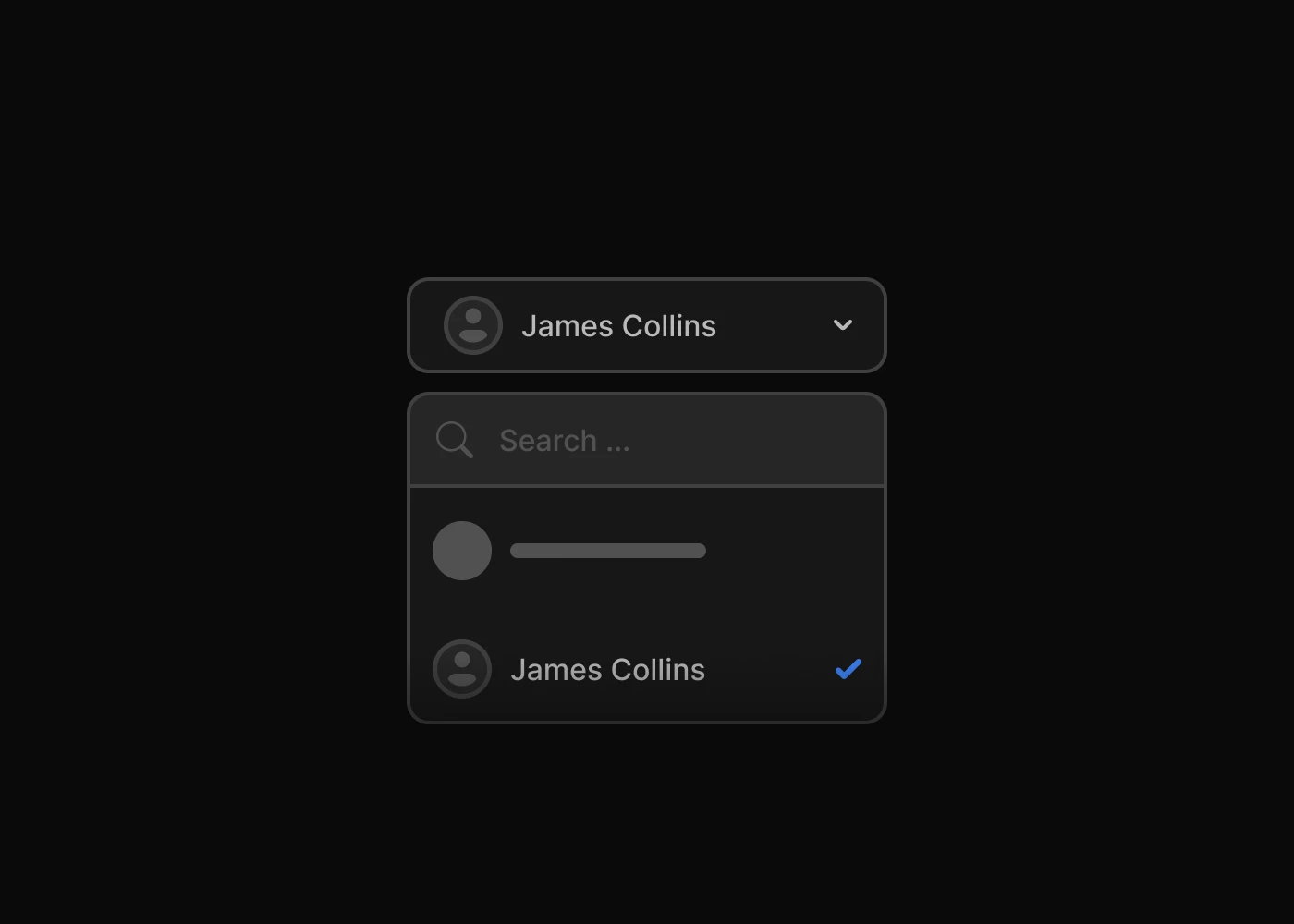
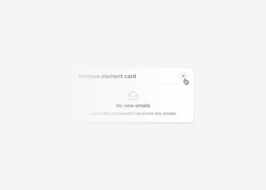
Tailwind CSS overlay plugins for dropdown menus, modal and drawer behavior, tooltips, and popovers that support accessible interactions in websites and web apps.

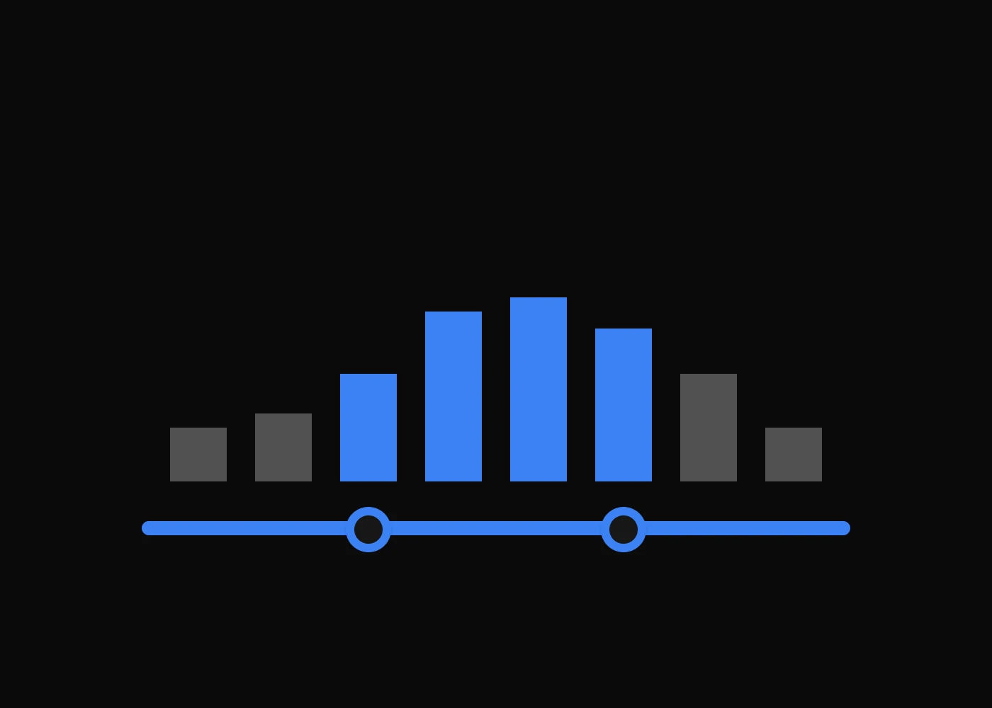
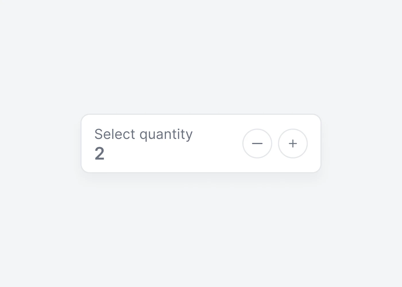
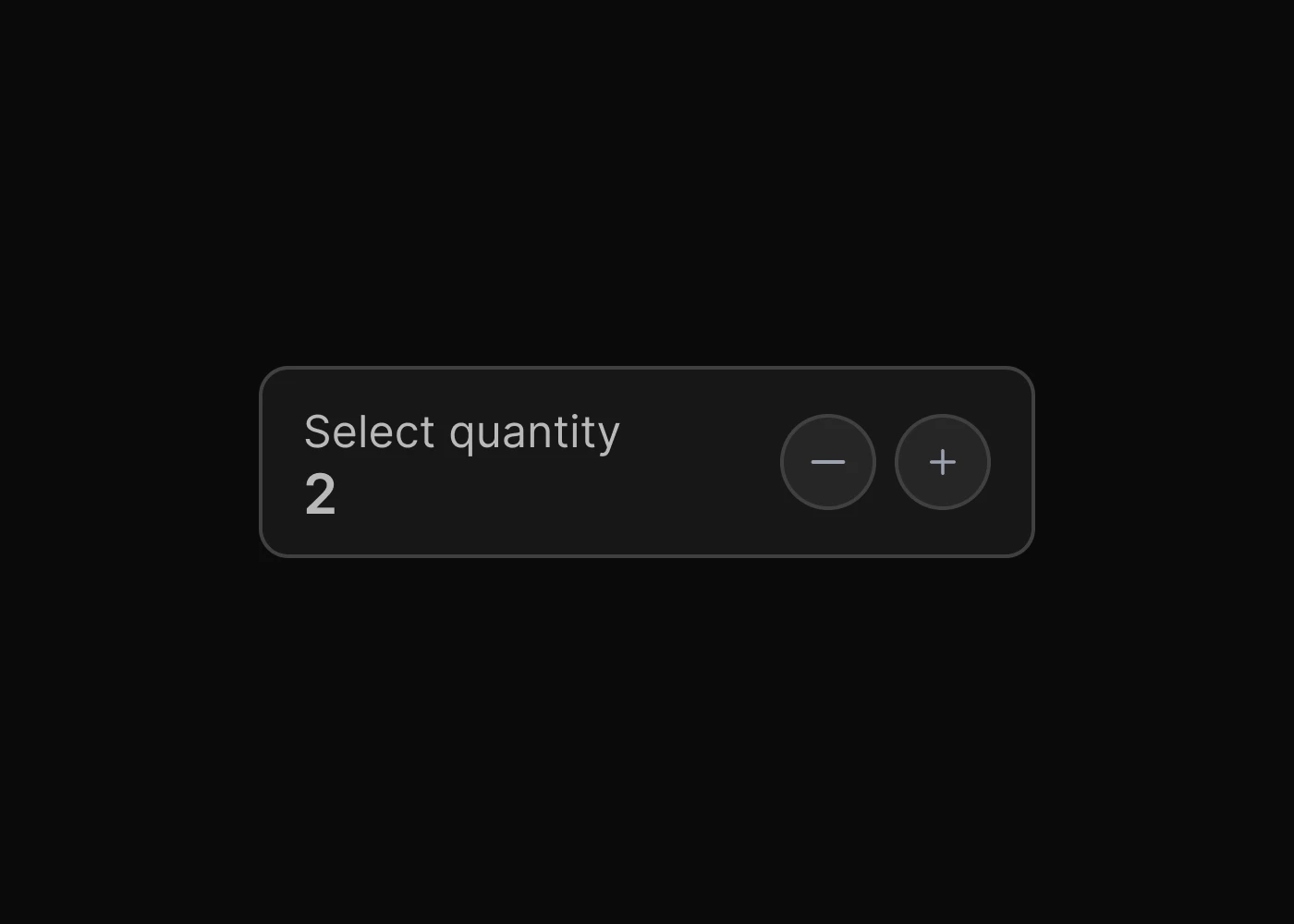
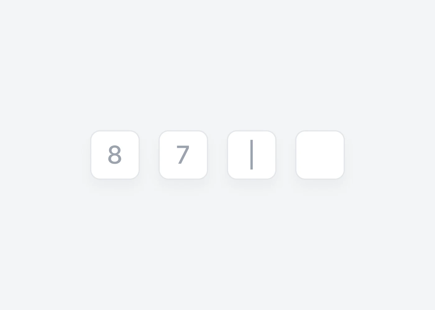
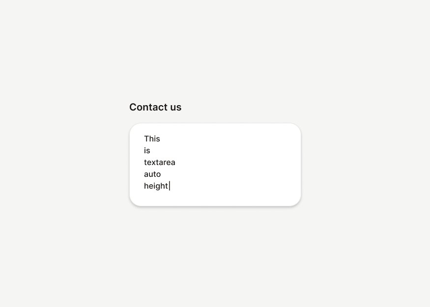
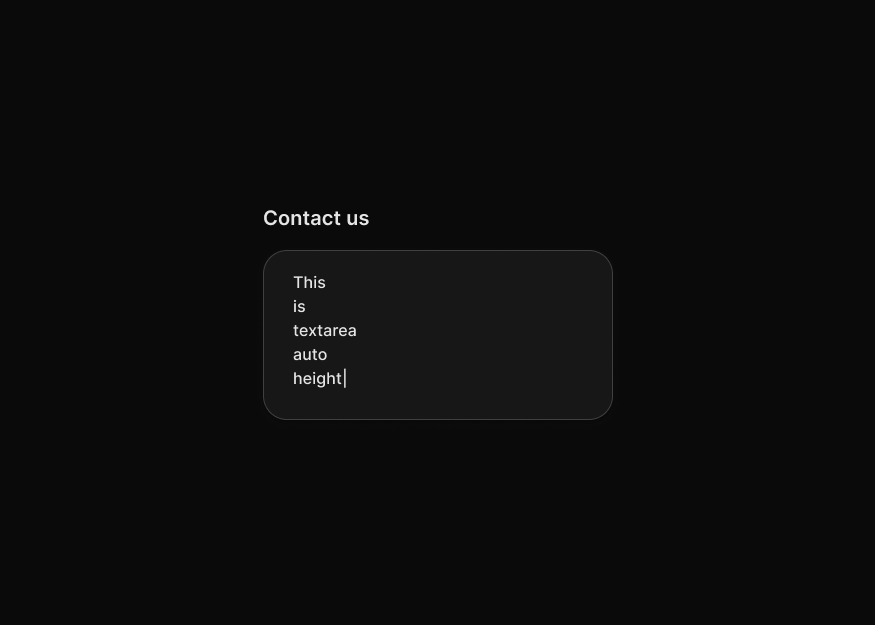
Forms
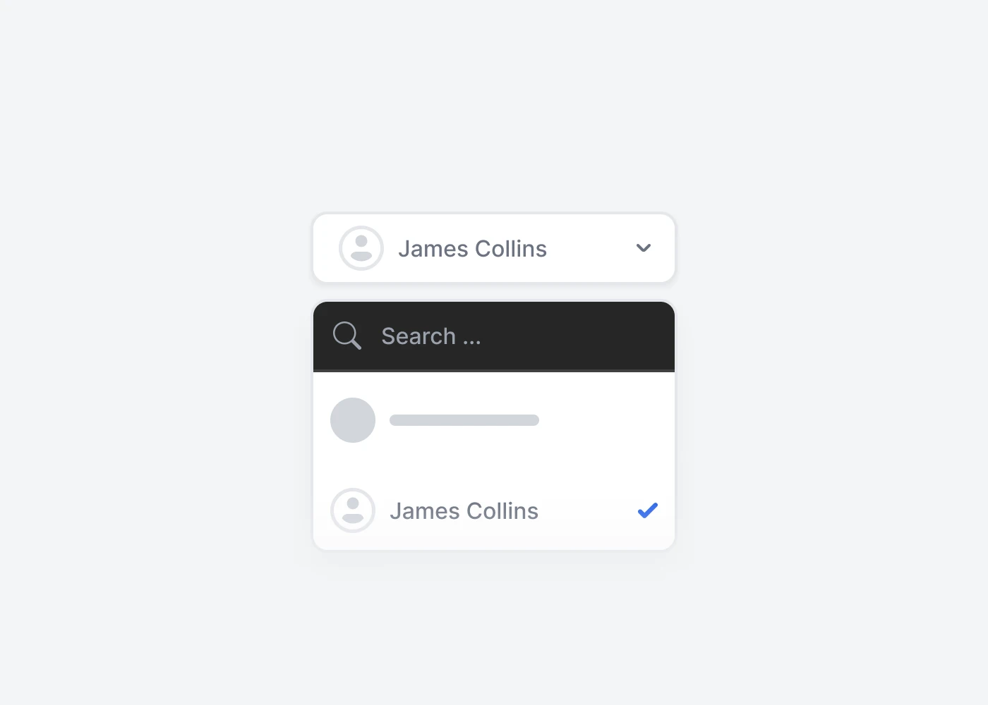
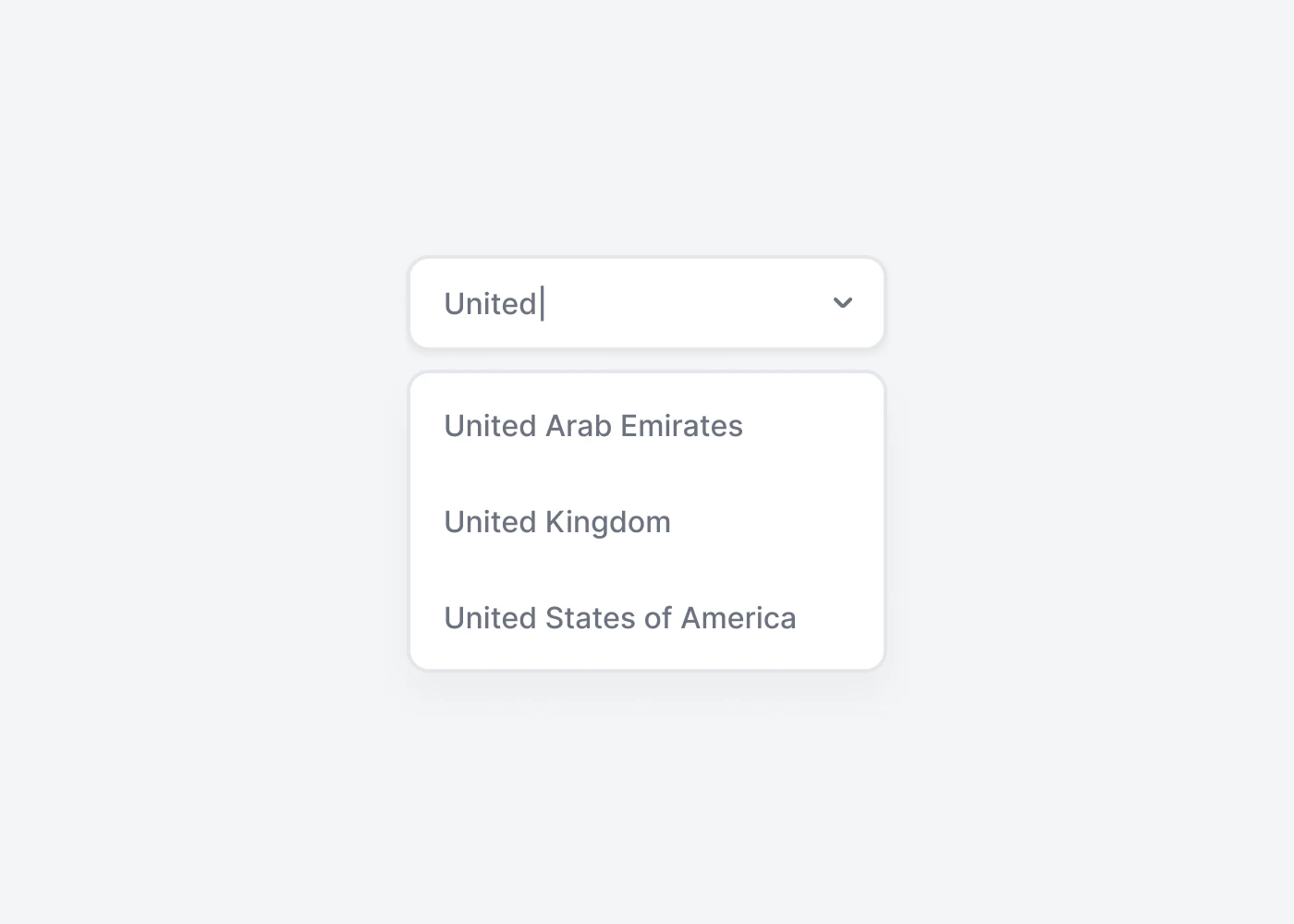
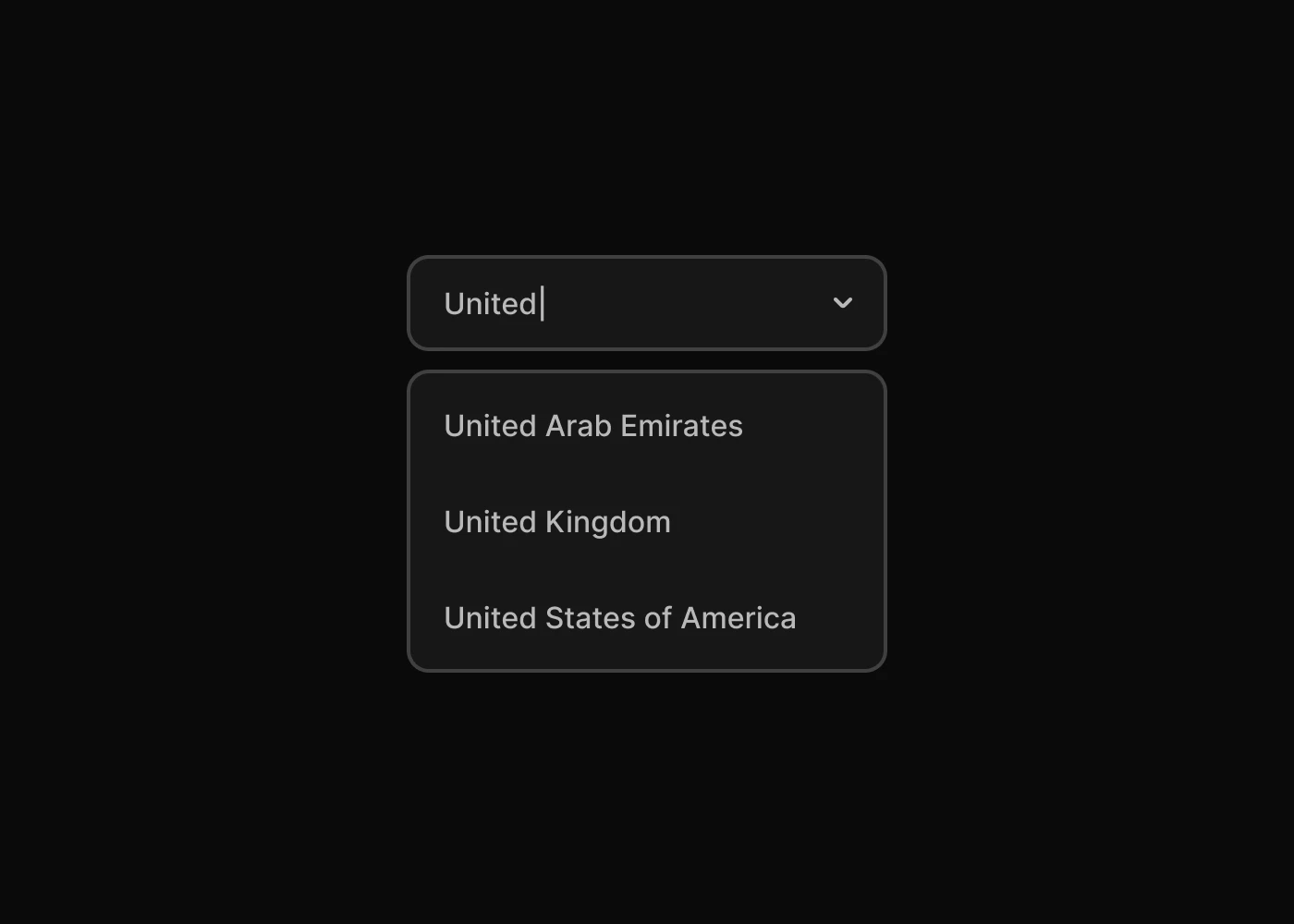
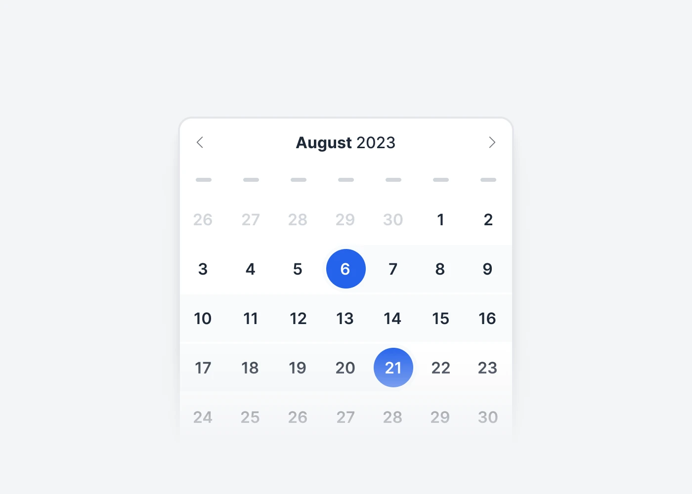
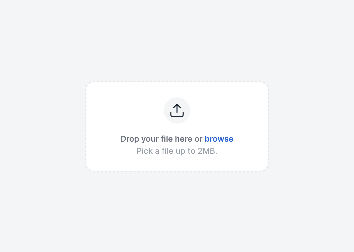
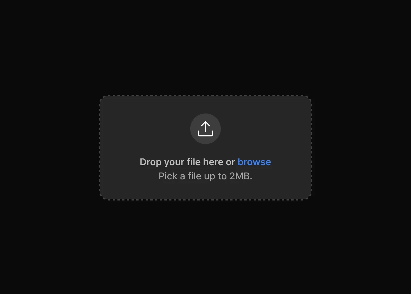
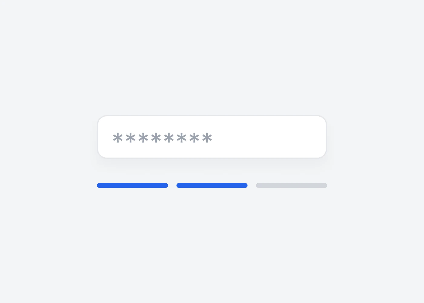
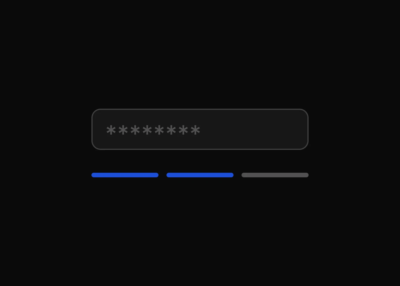
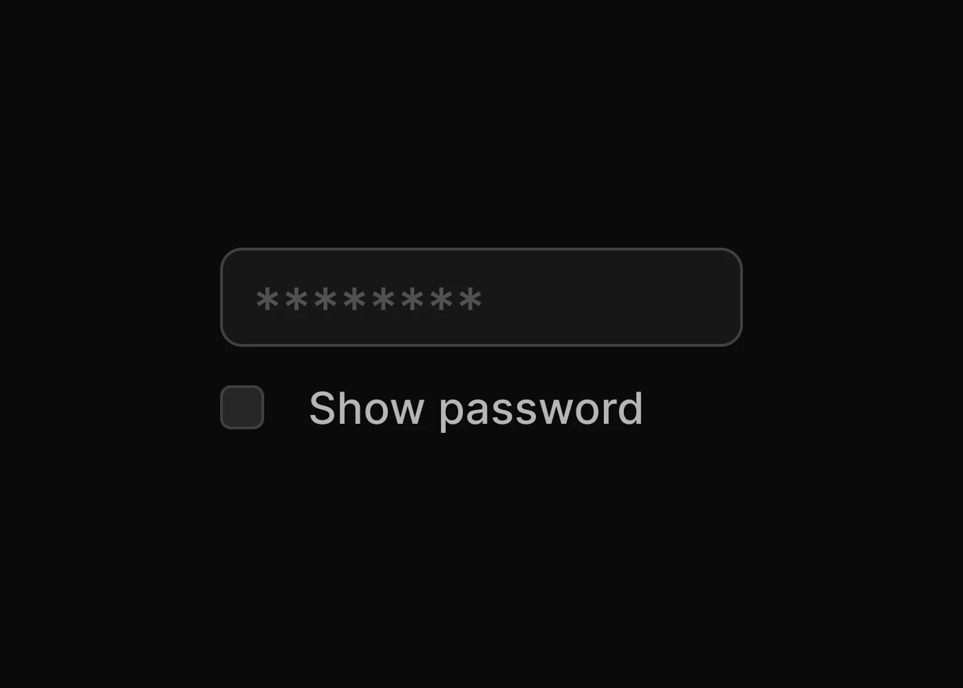
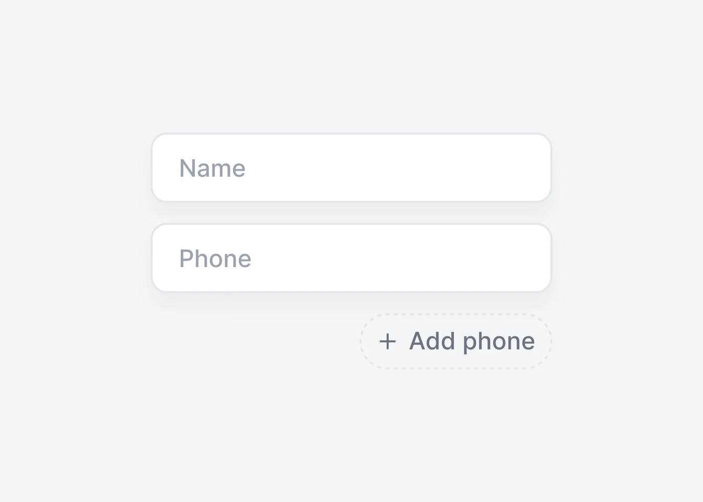
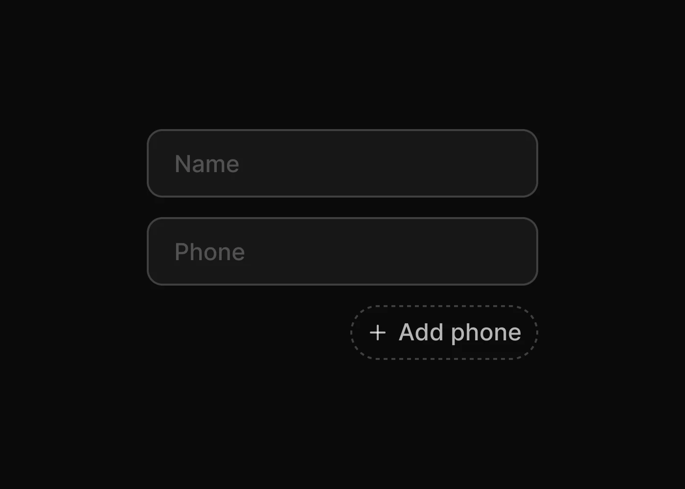
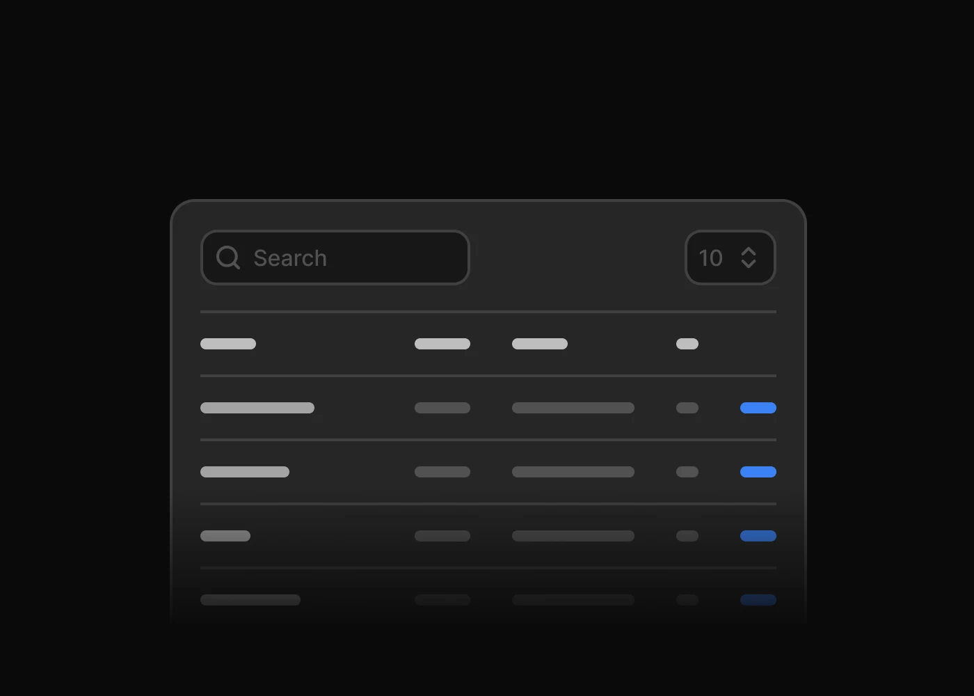
Tailwind CSS form plugins for advanced select inputs, autocomplete, datepickers, range sliders, file upload, password fields, PIN entry, and dynamic form controls.


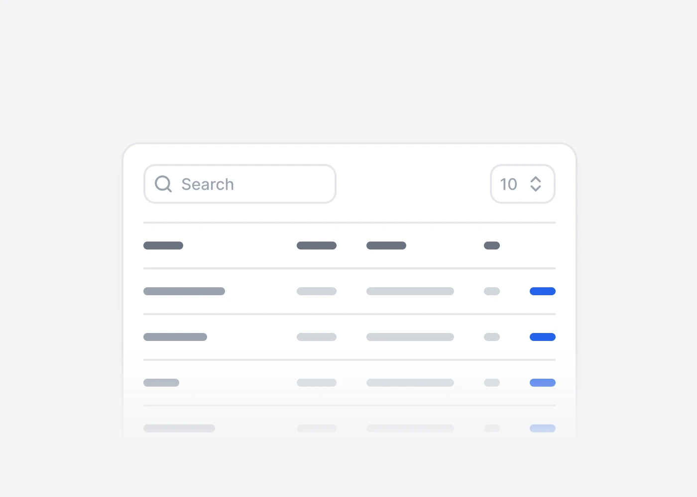
More Tailwind CSS Plugins
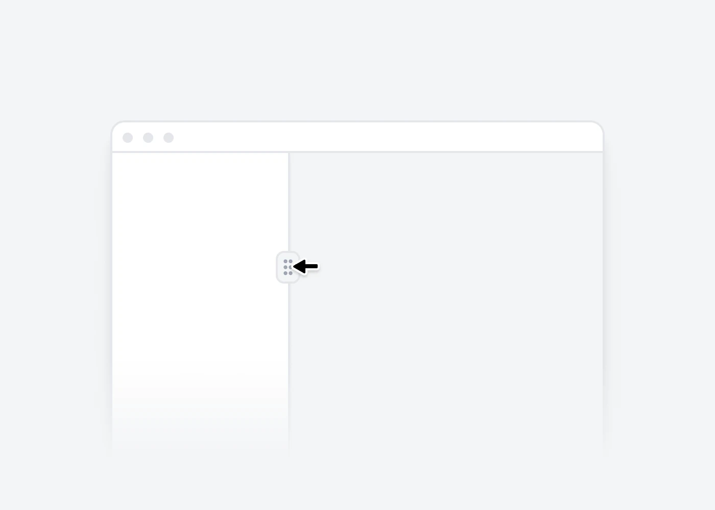
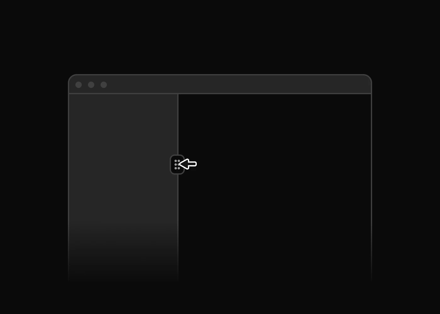
Additional Tailwind CSS plugins for carousels, layout splitters, theme switching, DOM utilities, and table interactions for modern websites and apps.


About Preline UI Plugins
Preline UI plugins add headless JavaScript and TypeScript behavior to Tailwind CSS UI components like modals, drawers, tabs, steppers, and advanced forms.
Headless Plugins
Use unstyled `hs-*` plugin markup to add behavior while keeping full control over Tailwind CSS styling.
Accessibility
Build keyboard-friendly Tailwind CSS interactions with ARIA-aware patterns for overlays, navigation, forms, and disclosures.
TypeScript
Use TypeScript-friendly plugin APIs and options to integrate interactive Tailwind CSS behavior with stronger editor hints.
Tree Shaking
Import only the plugins you need so modern bundlers can keep Tailwind CSS projects lean.
Auto & Manual Init
Use auto-init for static pages or non-auto imports when Tailwind CSS interfaces are rendered dynamically.
APIs & Events
Control plugin instances and listen to lifecycle events to sync state, analytics, and custom UI behavior.
RTL Support
Support right-to-left layouts with plugin patterns that adapt across multilingual dashboards, websites, and apps.
Theme Support
Headless plugins can be fully styled with Tailwind CSS and Preline UI theme classes across light, dark, and custom themes.
Tailwind CSS Plugin FAQs
What are Preline UI plugins?
Preline UI plugins are headless JavaScript and TypeScript utilities that add behavior to Tailwind CSS UI components, including accordions, dropdowns, modals, drawers, tabs, steppers, tree views, advanced forms, and more.
Are Preline UI plugins headless?
Yes. Plugins handle interaction logic while you keep control over markup, Tailwind CSS classes, and Preline UI theme styling.
Can I use Preline UI plugins with TypeScript?
Yes. Preline UI includes TypeScript-friendly plugin usage, options, methods, events, and selectors for typed projects. See the Preline JavaScript docs for TypeScript examples.
Do Preline UI plugins work with React, Vue, Laravel, Rails, and Django?
Yes. Preline UI plugins are compatible with frameworks where Tailwind CSS and browser JavaScript can run. They do not ship as framework-specific components by default to remain true headless plugins. To get started, explore the framework guides.
Can I style Preline UI plugins with custom themes?
Yes. Because plugins are unstyled, you can fully style states with Tailwind CSS utilities, Preline UI theme classes, dark mode, RTL support, and custom design tokens.
Do Preline UI plugins initialize automatically?
Most plugins initialize on page load. You can also use non-auto imports and manual initialization for dynamic interfaces, SPAs, and selectively loaded interactions.